Something Eerie for July 10th

What a month! Along with Batman '66, I have a second, equally retro-cool comic coming to shops this Wednesday, July 10th, as part of Eerie #3. Eerie#3

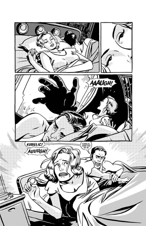
Saturnian Infantroids!

This one's an homage to Wally Wood space-race comics. It has comedy, horror, and giant space babies run amok. After becoming a dad and spending so much time in earnest adoration, it was time to shed light on the dark side of cute babies. The dark side of the babymoon.

I drew this while I took loving looks at my giant EC Stories collection. What I discovered: In almost every respect, the gap between myself and Mr. Wood is much like infinite space itself. Still, it was a fun challenge, and I'm pleased with the results.

I promise you a very weird time.

For a preview of this, and the book's other stories, head over to Comicosity.

Batman '66 Makes its Comixology Debut - Today!

Batman 66 is OUT!  

Batman '66 is out, in a digitally-enhanced edition. It's weekly. It's all-ages friendly. And it's 99 cents on Comixology. How about that?

"But wait," you say, "what's all this about digitally enhanced blah-bah-dee-blah? Are you trying to get me to read motion comics?"

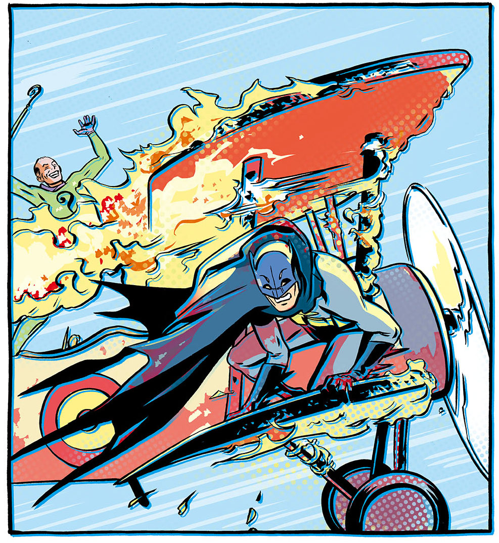
No, in fact. Today's release is more like a guided-view comic (where the Comixology software escorts you around the page elements), but with some significant perks, driven by the creators. The entire print comic has been reworked, expanded, and retooled by me, personally, then handed over to the engineers (I like calling them that) at Comixology. So all the enhancements are largely based in what our small creative team wants readers to see, and (importantly) what we think will look cool. Here's a quick look at how we make the sausage.

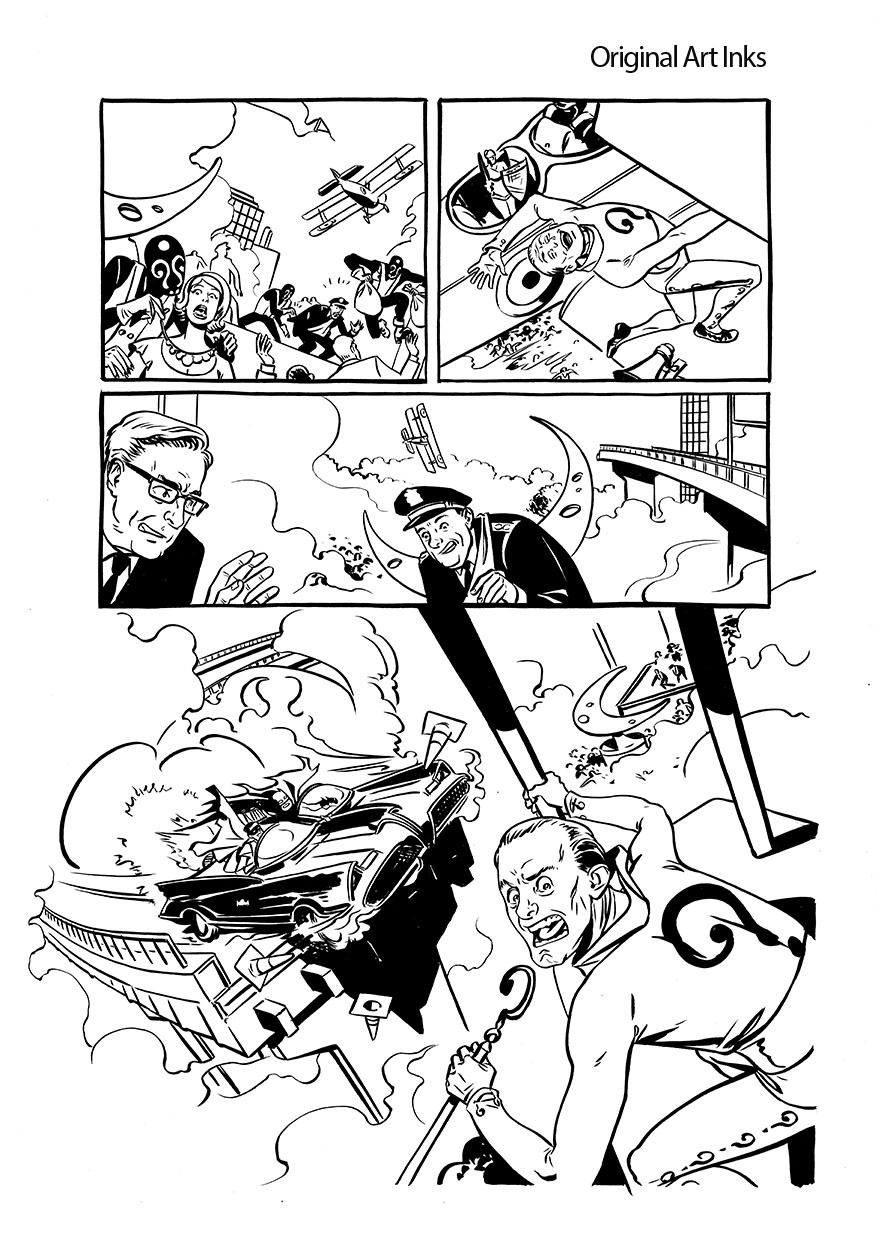
I drew all the art as if for print, with the narrative connections from panel to panel that are essential to reading a print comic. I wanted to make a comic book, so when you pick it up in stores, it's going to look like a comic book should look.

Inks

After I completed print art, I set about expanding certain sections for the digital version based on a master plan created with Jeff (writer), Jim (editor), and John (Comixology guru). Man, that makes 4 'J's' on this book. Never thought of that before. ANYWAY.

One effect I'm proud of engineering is the Batmobile's big reveal, where we do a fast pan from one panel, through a field of clouds and speed lines, to the next panel, and a big impact shot. Initially, Comixology warned that the effect might require an image too large for their system, but they made it work, and I think it came out very well. Wired has a video of all this on their website (thanks, Wired!), plus some further discussion, so you can check it out for yourself.

Transition

So there's a taste of what your 99 cents buys you. I'm really looking forward to seeing this in print, but I'm also glad that people who buy digital get added value. Not to stop anyone from buying both, certainly.

Have a great comics Wednesday, everyone. The Twitterverse is all lit up with good Bat-vibes (eh?), so this wild experiment may have worked.

More to come!

Batman '66 Week Starts Now

Batman '66It's BAT WEEK, boys and girls! Batman '66 #1 (part 1 of 3) goes on sale in a digital enhanced edition this Wednesday, and to make with the pomp and circumstance, the NY Post is running a series of articles and blog posts detailing the project. Today, there's an interview up with me, Jeff Parker (writer), and Mike Allred (cover artist), and another post with some general info. Coinciding with '66's release is an announcement from Comixology that comics like this will now be available on a subscription basis. Pretty cool option for a weekly series.

I'll try to put up some behind-the-scenes material as the week progresses. For now, head over the NY Post to catch some freshly revealed artwork!

Hope you dig it.

Batman '66 Plane

Surface Pro Pen Pressure for All

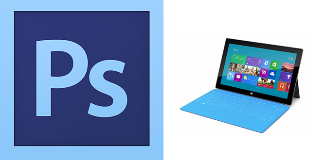
PS_Surface They did it! After three months of no pen-pressure support in programs like Adobe Photoshop, Painter, and Paint Tool SAI, Microsoft and Wacom have worked out a driver for the Surface Pro that fixes it all. Head over here to snag it:

www.wacom.com/feeldriver

This is a great thing for a couple reasons.

Number one, it makes the Surface Pro a useful device no matter what creative programs you run. You can now get one with the confidence that pressure support will work as you'd expect across all your major programs.

Pressure support on Surface

Number two, it works very well. Better, in fact, than previous Wacom pressure drivers I've used on tablet PC's. Remember that Fujitsu T902? It, and other systems like it suffer from less-than ideal palm rejection (meaning every once in a while your canvas goes "SEE YA, I'm going over here now because you touched me with your hand before that pen tip, and that hurts me"). There's also typically a weird bug where every fiftieth brush stroke or so, these systems randomly lose pressure support, leaving you with the burden of hitting 'undo' frequently. Granted, the driver's only been out for a day, but so far I've experienced none of that with the new Wacom driver on the Surface. It works more like what I expect from Microsoft's Ink API, where palm rejection and pen pressure are very consistent. This all makes me a happy nerd.

The New Hotness

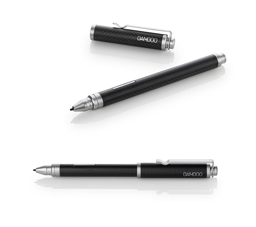
In other news, I've done another upgrade to my setup in the form of a different pen. This is the Wacom Bamboo Feel (I got the Carbon, because it's more durable and has a nice weight in my hand). I find it to be more accurate than the stock Surface pen, and more similar to the calibration of the pen on my old Cintiq. Explanation:

GAH! Stop hiding!

With the stock Surface Pro pen, the little doohickey that says "Here I am" to your on-screen cursor is placed slightly back in the barrel of the pen, instead of the pen's tip. This means that the cursor is usually hidden beneath the pen tip instead of being just in front of the pen tip, as you'd be used to if you use a Cintiq, or other tablet device.  This picture's taken from the side, so you can actually see the cursor, but when viewed normally, facing the screen, you totally can't see it. There are attempted calibration workarounds to this, and I tried them all and found them insufficient.


Switching to the Bamboo Feel, you can see the difference in registration: that cursor is right in front of the pen tip, where you expect it to be. This makes joining fine lines in a drawing and picking through tiny interface elements on the Surface's hi-res screen MUCH easier, at least for me. Your mileage may vary, but I'd say give it a shot if you aren't satisfied with the stock stylus's accuracy.

Tech blogging complete. Moving back to pretty drawr-rings.


Surface Pro Lap Board

  It's a Nerd's World.


People have been asking for specifics on how I made the lap board for my Surface Pro. It's a pretty simple system, but one that's very effective for using the Pro on my lap or on an inclined desk, like I normally use for drawing. And it's a great conversation piece at parties, because now you can bring all your work to parties and sit in a corner and draw Batman.

Keyboard Support

The basic problem I needed to solve: The Surface Pro's keyboard can obviously lay flat with the machine, but it's very thin, and attaches just beneath the screen, leaving about 5/8" of space beneath where it would rest most naturally. If you try and type on it like this, you're always pushing the whole keyboard around and missing keystrokes. It just doesn't work. With the lapboard, I get a perfect support so I can type anywhere easily, and more importantly, have access to my art programs'  keyboard shortcuts.

Blah, blah, blah, you say. How did you make it?

Like this:

The lap board: One piece of smooth 1/4" MDF, cut to 11" by 15.5"

The keyboard support: One piece of something that's 5/8" thick, 11" wide and 6.25" tall. I used a piece of wood for this that wasn't thick enough and added a few pieces of thin cardboard to make up the difference. Thus, there's duct tape on my otherwise nicely wood-glued assembly. You need not do that. Just make it 5/8".

The bumper-things. Two lengths of 3/4" trim, cut to 10.75" each - the kind I got is like one quarter of a cylinder (There's probably efficient terms for all these things, but I'm not Bob the Builder, sorry). This makes clearance for the angled edges of the Surface Pro. The Vapor MG casing  scratches really easily, so I made sure to round things off wherever I could. The upper piece is the only one that comes into contact with the Pro. The lower one is optional, and doesn't do much but give a sense that the whole thing's a solid slab.

Surface cushion. I don't know what you call this. It's that weird non-skid stuff that old women put in cabinets to keep their frog mugs from sliding around. 10.75" by 6.25" I hot-glued this to the lap board. There may be a better way. Adhesive spray, perhaps?

Hugs. Two rubber bands, to hold the Pro to the board and provide another non-skid effect to the under-side (provides a little more security on my smooth, inclined desk). I want to find some black ones that are thicker, for aesthetic purposes and to hold it a little tighter. For now, these work.

It's a nerd's world.

So, once you have all that, use some wood glue and clamps to piece it together, then do a little Dremel action to make the rubber band slots and sand down the sharp places, and boom. You can now do your work while lounging. It's work and laziness together!

This gets it all done really well, but it would be cool to try v2 with lighter materials. If anyone wants to give me a 3D printer, I accept.

Have fun!

My Transition to Surface Pro and Manga Studio

Painting in Manga Studio 5 My fellow creative-industry Apple users: prepare thyselves. Heresy lies ahead. You may not like what I have to say. You may think I'm batty. That's fine. For myself, I'm at the end of a months-long quest for a more flexible workflow, and I'm having quite a bit of fun. It was a bumpy road getting here, but for me, moving my digital art production from a giant Cintiq to the Surface Pro was the right move. If you have a similar desire to break your desk-bound chains and put on the shackles of forever having your work with you, read on. We can share the crazy.

Evil? No, no, creative person. Not evil.

What I wanted: a truly portable Cintiq replacement with good ergonomics (boo to you, tablet PC), a full OS (boo to you, Samsung Note) and enough horsepower to run professional software with ease (boo to most of the rest of you). Tablet PCs (as opposed to slate PCs/hybrids/whathaveyous) have been around for ages, and initially, I tried one of the latest and greatest, the Fujitsu T902.

Blech.

It had tons of power (16 GB of RAM) and the standard Wacom digitizer, but it proved problematic for several reasons. Its hardware was awkward and difficult to hold (for me), its drivers were frustratingly glitchy, and its screen was lackluster. On paper, its hardware specs meant that all my software would run well, so I really wanted to like it. In the end, it just wasn't the right fit, so I returned it and continued the hunt.

I was initially turned off from the Surface Pro for its smaller screen and RAM limit of 4 GB. Photoshop users who work on large color files know the importance of RAM. Illustrating for print, 4 GB is adequate, but 8GB can make a dramatic difference. To that end, I started looking at a new Thinkpad called the Helix that's very similar to the Surface Pro, with some nice perks. It has a larger screen, double the pen sensitivity, better battery life, better keyboard, and the option for 8GB of RAM. Unfortunately, it was supposed to come out in January, but missed its ship date several times over, and as of now, it's still not widely available. After purchasing that T902, I sold my Cintiq, because I play it fast and loose like that. After returning the T902, I was without a digital art tool. You may ask why someone who makes their living with digital art tools would put themselves in such a position. To you, I say, in a child of Bill Cosby voice, "I-DOH-NOH!"

Bye-Bye, Behemoth.

There's been a lot of mixed press around the Surface, and a whole bunch of Apple users (I've been one for years) will forever be set against anything non-Apple. For them, the closest option in this category is the Modbook Pro, but it lacks a keyboard, has a non-touch optimized OS, and is ridiculously expensive. Like, three times the price of a Surface Pro expensive.

Back to the Surface, there's also the concern for digital artists that several months after its release, it still lacks a pressure-sensitive driver for WinTab coded software. All this gobbledygook means is that the Adobe Creative Suite, Painter, and other major creative applications lack pressure support (imagines self as Microsoft engineer and smacks head). Usually, you can just download a Wacom driver and apply it to a system like this, but in this case, Microsoft monkeyed with the Wacom hardware/software and made it proprietary, meaning, no driver for you. Yikes. Another annoying issue in trying to run the Creative Suite on the Surface: you can't hold and click the tool bars to access sub-tools with the pen. It's some kind of problem with the driver not registering a click-and-hold in Adobe software. Beats me. At any rate, those are big points against the Surface. Will these problems be fixed? Microsoft tells me so, but it was almost enough to get me off the boat, until I made an important discovery called Manga Studio 5. More on that later.

Newmar-riffic.

So what does the Surface Pro get right? I like the shape of it, I like the portability, I like the quality of the screen, in spite of its high resolution making some interface elements tiny. Bifocal users, beware. Ironically, one of its best qualities for my use-case is something Microsoft never intended - laying the screen and keyboard flat so I can work on an inclined surface, like a drafting table, and have access to keyboard shortcuts. One of the things I disliked about my Cintiq was the clunky nature of using a keyboard for shortcuts when that big screen was taking up so much desk space. Wacom tries to fix this by giving you programmable buttons on the Cintiq itself, but somehow those are never enough for me. I guess I use mad keyboard shortcuts. With the Surface, my keyboard shortcuts are directly under that little screen in a very convenient place. It works well for me, especially after I built a little custom lapboard, which supports the keyboard in a solid way and holds everything in place. This way I can use the machine on my desk or on my lap equally well.

One trip to Home Depot later.

Right now, people are either shaking their heads in disbelief or nodding them with nerdly DIY approval. Again, I'm having fun, and it actually works. I can pack the little lapboard in my backpack with the Surface, and head to my studio, or a client's office, and go to work with naught more than a chair. Just a couple days ago I worked on contract for a local design firm and did 100 storyboards in seven hours with this setup.

But what about the Creative Suite, and all that driver brokenness?

Soon after I picked up the Surface, I faced that problem. I had a job I needed to do, and no functional Creative Suite with which to do it. I went looking for a temporary solution. It turns out that some very good software does support Microsoft's drivers, including Sketchbook Pro and Manga Studio. I'd never given Manga Studio a chance, because I was so used to Photoshop and got turned off by the clunky interface of older versions. People lauded it, but I was too stubborn and set in my ways. I knew Photoshop wasn't a good replacement for drawing with pen and paper, so I didn't expect Manga Studio to be much better. I figured Wacom hardware was the main limit between what I could get from traditional media and what I could get from digital. With digital tools, I've been used to getting maybe 50% of the control and finesse I can achieve with good old pencils and brushes on paper- that's with the pro-grade Cintiq. It's fine for coloring, edits, and quick and dirty jobs like storyboarding, but from what I'd experienced, it couldn't hold its own against pencils and paper.

Manga Studio changed that for me in a big way.

Get your Gorshin on with Manga Studio 5.

With its latest version (5), Manga Studio has a fancy-pantsy new brush engine. What was already markedly better than Photoshop became hugely better with this latest release. I can now get results that are 90-95% of what I'd expect to get with traditional media, and that's just the brush engine. There's also superior capabilities in terms of layout, coloring, and perspective tools. I came to my studio as an evangelist, and immediately got 15 colleagues to make the leap with me. So far, everyone's digging it, and thanks to the new version's UI being similar to Photoshop's, the transition hasn't been difficult.

They aren't even paying me to say this, but listen: If you're an illustrator and haven't given Manga Studio 5 a shot, please do. I think you'll be pleased. The current Debut version lacks a few of the capabilities of their previous EX version, but an update's coming this summer that adds those features back in. In the meantime, you have a fantastic piece of software that has all the brush-creation, actions, CMYK color space, and tools you never thought of, for like, so little money it's hard to take seriously. Try it.

Pencils in Manga Studio.

I made the switch to doing all my comics pencils in Manga Studio on the Surface with Batman '66, which I'm leading off for DC. Likewise, an Eerie short story for Dark Horse. This is an example of my Manga Studio blue-line art, and it's really indistinguishable from my traditional pencils. I can then print it out on our large format printer and ink it traditionally. That way I don't have to spend my whole life in front of a screen, and I have original art to sell if I choose to do that (and choose to do that, I will).

Batman

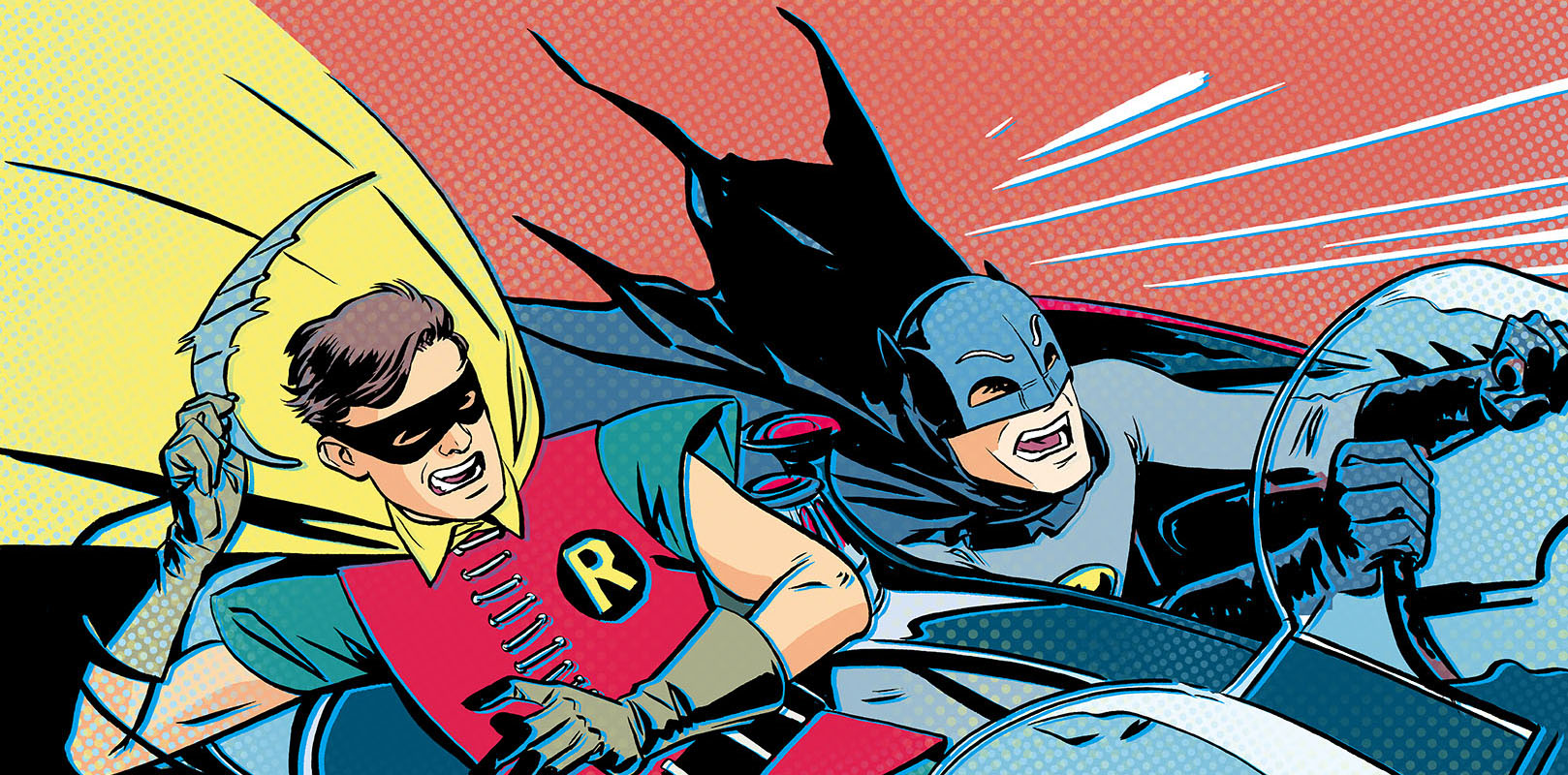
But even if I didn't want to do inks traditionally, it's possible to get really good inking results on the Surface with Manga Studio. Here's an example of our launch art. After they had me execute this (pencils in Manga Studio, then inked traditionally), DC came back and requested I expand all the characters to full figures. I was able to bring the original art into Manga Studio (I'd already colored it there) and expand each figure and their colors with seamless results.

Those elfin shoes crack me up.

I've even started playing with digital painting, which I haven't done before, using the Surface/Manga Studio combo, and I'm really digging the results. It makes me want to get out my oil paints, and that's about as high a compliment as I can pay a digital tool (I've kept those paints in a box since college).

By the way, when you get Manga Studio, as you will, be sure to check out Ray Frenden's MS5 brush set. I'm using it daily, and it's fabulous.

So that's my journey so far. There seems to be a lot more on the horizon in terms of these portable solutions, so things will only get better. For the sake of artists who will never leave the Apple ecosystem, it would be great if Cupertino tried their hand at something like this, but Steve Jobs once said, "if they include a stylus, they've failed", so that's probably not gonna happen. Even so, if you're well heeled enough to have two Cintiq-like devices, one for your office, and one for the road, I'd recommend something along the lines of the Surface.

Or just be crazy like me. Bite the bullet and make this your sole computer/art tablet/etc. It's scary, but it's also the first time that upgrading to a new system actually made me money, since I sold my Cintiq and Macbook for much more than the Surface cost (and they were both four years old).

And now I can run free as bird, unchained by the... oh, yeah. Work's with me everywhere now.

Back to it!


Holy Retro Batman Announcement

Batman  

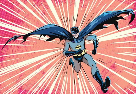
Today I get to announce some really fun news. Really. Fun. Comics. News. My studio-mate and fellow lover of retro, Jeff Parker, is set to write a new series of Batman comics for DC, and I'll be performing art duties for the first three stories, from layouts to color.

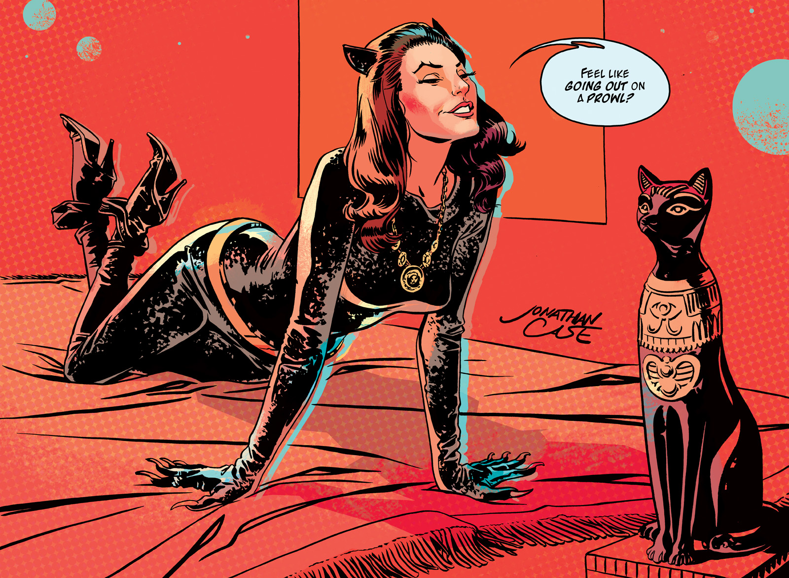
This isn't just any Batman though. This is the Adam West Batman, the Batusi Batman, the Julie Newmarriffic Batman. DC licensed the rights to all the actors from the 60s TV show (!), and we're set to start reeling and rocking this summer. Really, if they let me develop with any superhero project, working with whoever I wanted, I honestly couldn't have come up with a better fit: lighthearted, kid-appropriate, retro, and written by one of my favorite comics writers. The script Jeff's writing for this series is gold. You can feel his love the material, the era, the Julie Newmar.

DC announced the project last night at an event in Los Angeles. Mr. West appeared for a signing with the original Batmobile, a replica of the Bat Cave... even Batman cupcakes. Here's the press release. You can see a glimpse of my art at like, 4:13.

BATMAN CUPCAKES.

I really don't need to say more than that.

Julie Newmar Catwoman

If you want more info on all this, head over to DC's site (I think they have a bunch of 60s Bat-stuff they're announcing), or Jeff's blog. As for me, I'm going to start some layouts.

Holy happy circumstance.

Live Interview on the Karl Show! (starring Jason)

Wolfman JackTomorrow night: Me, the interview, live, on The Karl Show! (starring Jason), broadcast from The Portland Radio Authority. I get to play DJ for an hour or so, talking about my work and playing some tunes. What sort of tunes? Some that inspired Dear Creature, some that I just like, some that are tailored to give me street cred with people in their 70s.

If you can't catch it tomorrow, they'll post the whole shebang on their website, here. Now I'm off to drink lemon honey tea.

The Creep #2 and #3

Oh dear. Better late than never... I've been under a self-imposed writing rock since October, and a lot of things, like having another two issues of The Creep coming out, slipped by. They both have absolutely terrific covers from Ryan Sook and Tonci Zonjic, respectively. Check them out! There's also a hardcover collection of this series set for release next year (April, to be exact), using that lovely cover from Tonci. Looks like you can pre-order it through TFAW.

Modern Man PDXIn addition to writing, I also completed my largest painting yet, for the Hawthorne Modern Man Barbershop here in PDX. I couldn't be more excited about this, as it's one of my favorite businesses in Portland. More on that, and other bits from under the rock, soon.


The Creep #1 Signing Tomorrow

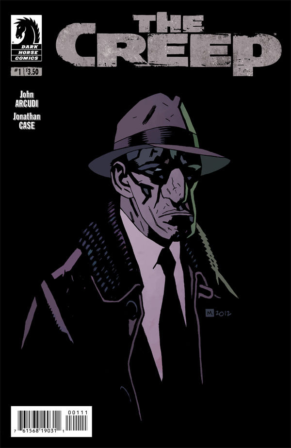
The Creep #1 Look at that! A Mike Mignola cover on one of my books. Like most everyone, I love his work, and feel pretty honored to have it gracing The Creep #1.

Tomorrow, you can pick this up, get it signed by moi, and have a beer and something to eat courtesy of Things From Another World on Broadway and 28th, here in Portland. The party starts at 7— head over here for the details.

Fall Commission Preorders

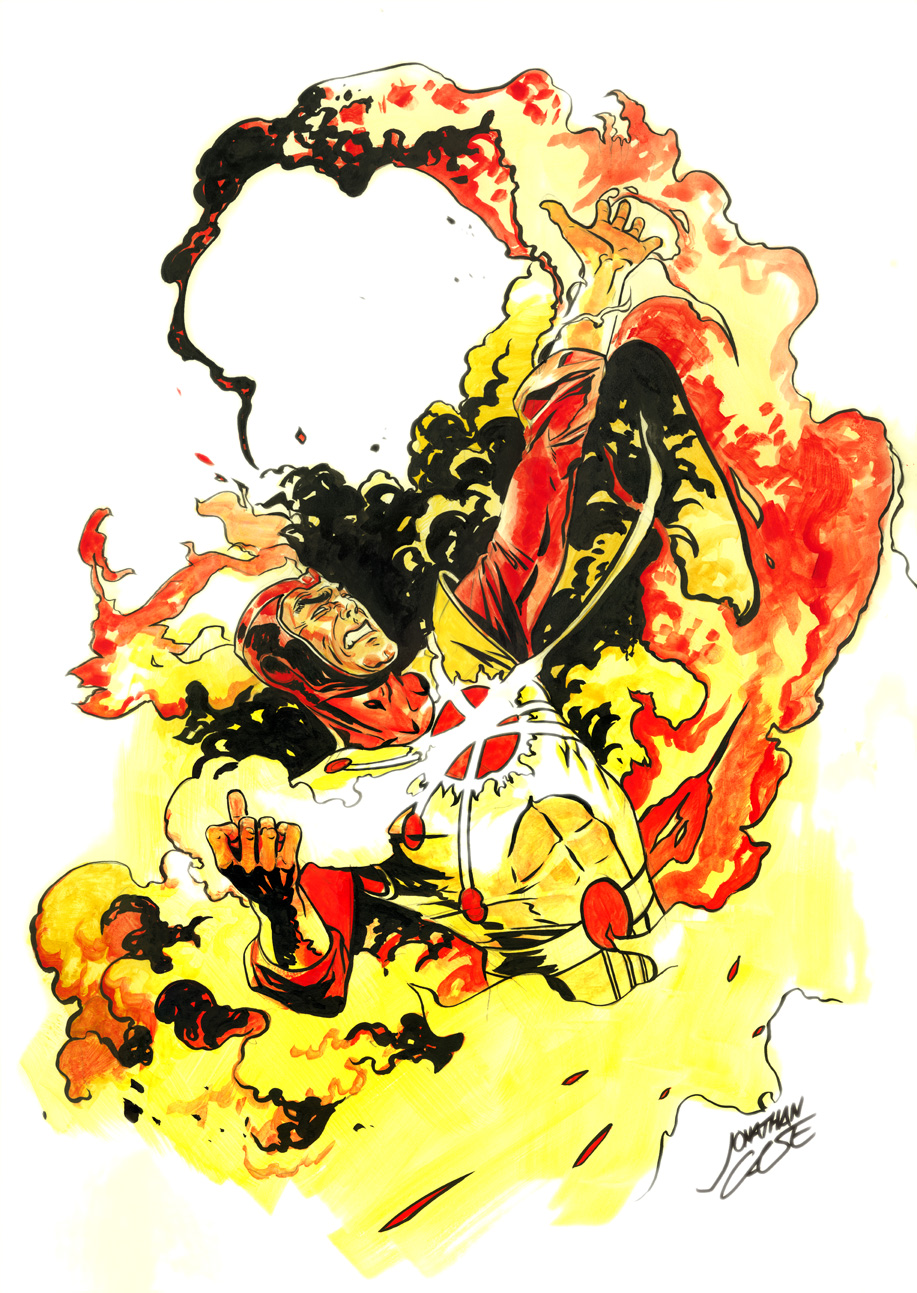
Firestorm, 10x15 ink and watercolor wash, single figure, $120.
It's fall convention season, and I'm starting up my commission preorders! Contact me to preorder a commission for New York Comic Con (via paypal), or get on the early-bird list for this weekend's Rose City Comic Con in Portland.

Here's the scoop on my rates and options this season.

10x15 (preferred working size)

Pencils (single figure): $50 Inks (single figure): $70 Ink and watercolor wash (single figure): $120

8x10

Pencils (single figure): $40 Inks (single figure): $60 Ink and watercolor wash (single figure): $100

If you want more than one full figure or a pretty involved background, it's just a multiple of my single figure rate. Here are more examples:

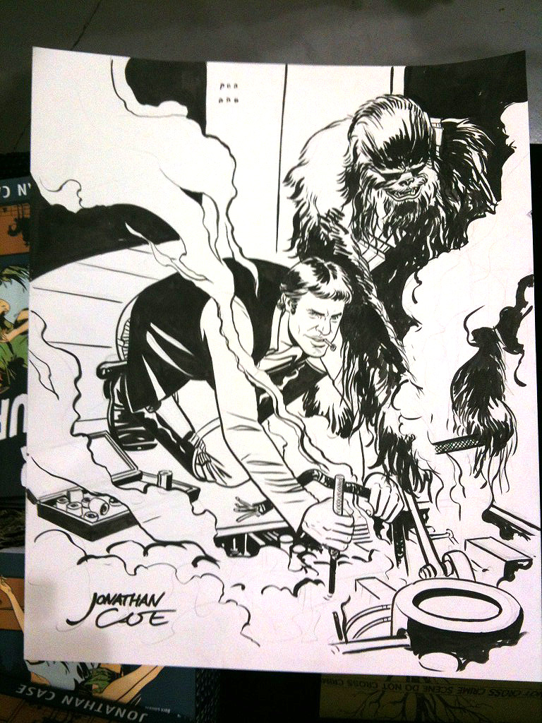
Han and Chewie Maintenance, 10x15 ink, double figure, $140.

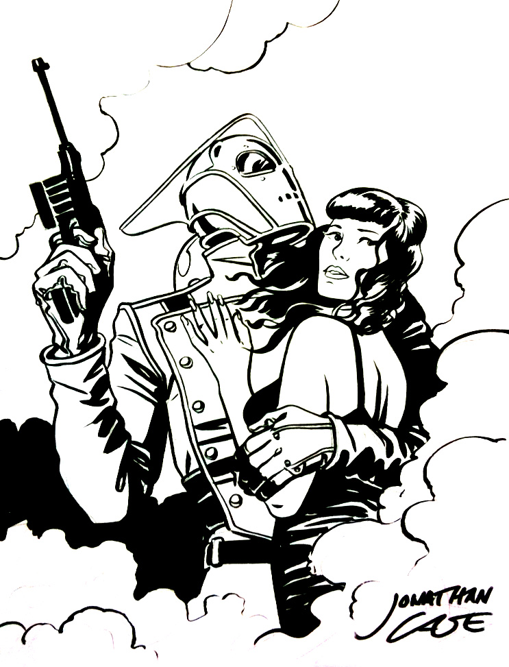
Rocketeer and Bettie, 8x10 ink, double bust (equals single figure), $60.

Yoda Cuisine, 10x15 ink and watercolor wash, single figure and full background, $240.

See you at the Con!

Jonathan Case: The Creep #1 Signing and Gallery

Creep Jonathan Case

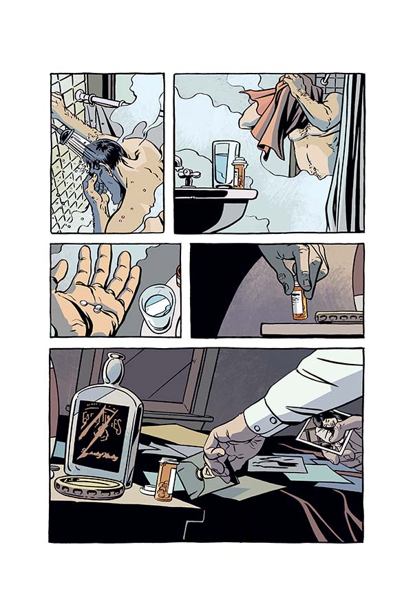
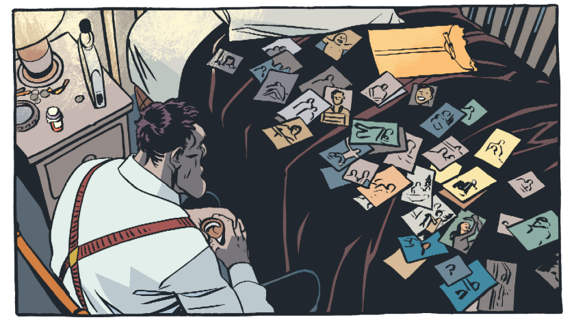
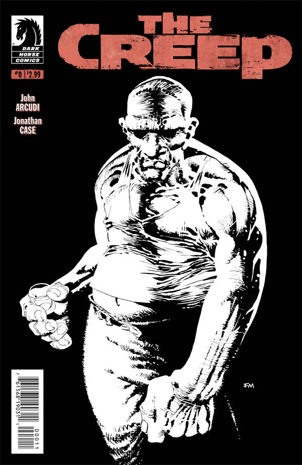
This week, I officially wrapped up my art duties on John Arcudi's wrenching neo-noir, The Creep. And yet ... the world's hardly begun to see it! That changes in September, as issue #1 of the Dark Horse miniseries comes to comics shops, following August's issue #0 (a collection of three segments we ran in Dark Horse Presents). It'll have a fabulous Mike Mignola cover (!) and a sweet release party/signing/gallery at the Portland Things From Another World store (Hollywood location). I'll be there September 12th, from 7 to 10 PM doing the requisite signing, and they'll have a gallery of my work up all month, featuring pieces from Dear Creature, Green River Killer, The Creep, and more. I may even put some of them up for sale. If all that's not enough to get you out there, I have four words: FREE FOOD AND BEER.

If you're near Portland, come out and enjoy swell comics folk, drinks, and 80's neo-noir-themed-hors d'oeuvres. Just kidding. But I wouldn't put it past Elisabeth, the TFAW master of ceremonies. She does it up right.

In related news, I'm happy to hear that a lot of you enjoyed issue #0. You crazy kids, you. Thanks for all the help getting this book noticed. And remember: the more issues of The Creep you read, the more sunlight you'll need for basking in afterwards. I promise.


The Creep #0, Out Today!

Creep Jonathan Case Arcudi

It's Wednesday, and that means new comics! Today sees the first issue release of my project with John Arcudi, The Creep. If you like noir, deformity, unrequited love, and visits from mysterious dream-bears, this is your book. Issue #0 collects the three segments run in Dark Horse Presents, wrapped up with a tidy Frank Miller cover.

Some great people say nice things:

"A beautiful book and, for my money, no one in comics writes better stories about human beings than John Arcudi." — Mike Mignola

5/5 — Comic Bastards

4.5/5 — BAMFAS

Right now, I'm finishing up the last couple pages for the miniseries over in beautiful Pacific City, Oregon (good thing, too, because this story goes WAAAAAY dark). I'm also putting a signing/gallery of original art together with Things From Another World in Portland. Details to come soon.

Between that, Rose City Con, and New York Con, it's gonna be a busy fall.

Eisner Win + Unseen Artwork

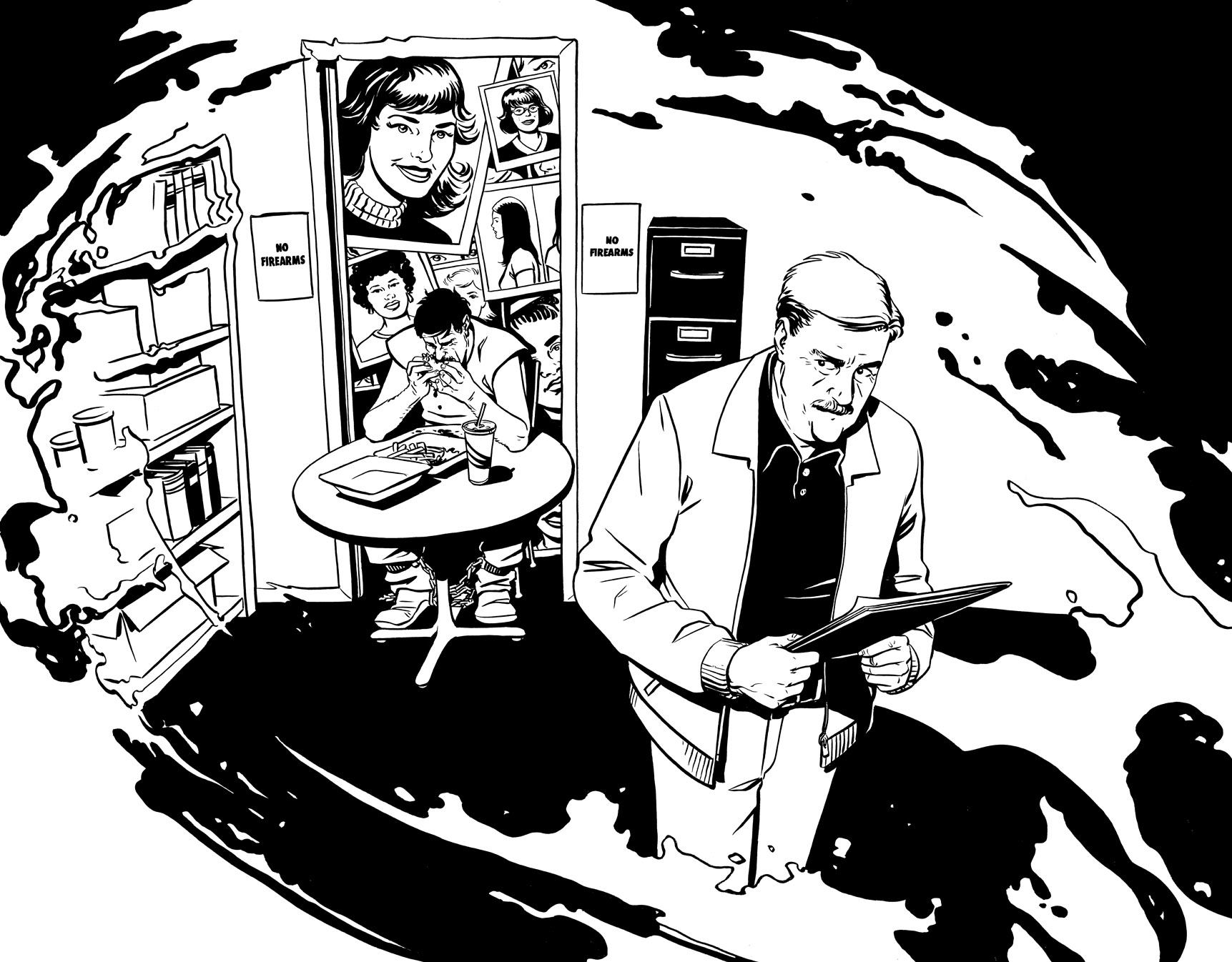
Last night the powers that be honored Jeff Jensen and me with an Eisner award for Best Reality-Based Work on Green River Killer. Quite an honor. I'm especially happy for Jeff and his family— their story is heroic in a way you rarely find in comics. To commemorate the occasion, here's some (typically creepy) artwork I did for a part of the GRK promotional machine that just never saw the light of day.

Green River Killer Eisner Jonathan Case

Annnnnnnnd.... I'm sure Jeff did a great job of this already, but since I wasn't at San Diego or the Eisners this time, I'll make my acknowledgements here:

Thanks to our editor, Sierra Hahn, for bringing this project my way and for being tenacious. Terrific job, Sierra!

Jeff Jensen, for telling his father's story with grace, and for entrusting me with the drawing.

Brendan Wright, our assistant editor, for never missing a beat.

The rest of the Dark Horse crew, especially the ones that cleaned up those speckled page scans.

The Jensen family, for their story, their warmth, and the delicious cookies from Mrs. Jensen.

My crew at Periscope Studio, for helping me through everything and keeping me from taking myself too seriously.

My family, for their support and encouragement.

Thanks, everyone!

I Love Gipi

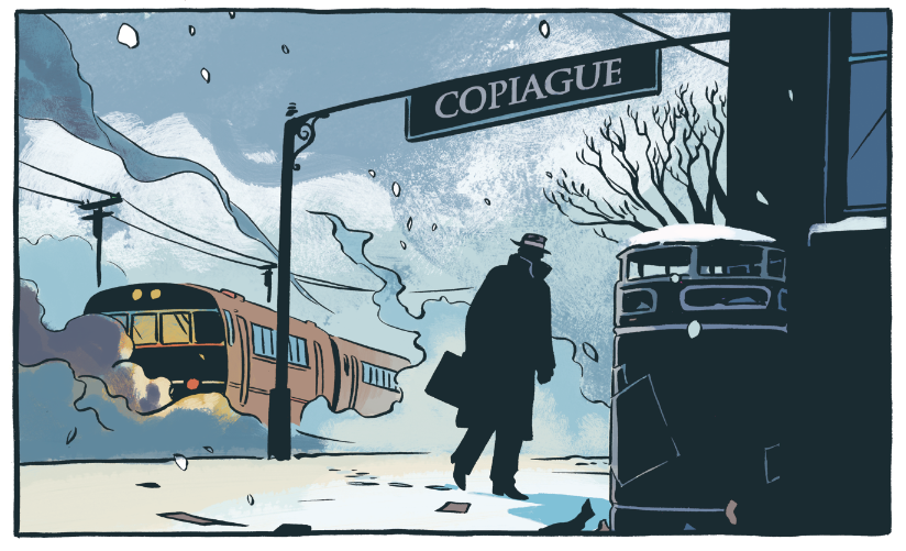
Happy Fourth of July, America. To celebrate our independence from those tyrants across the pond, I'm showing off my favorite non-English European cartoonist. His name is Gipi, and First Second puts out a good bit of his stuff stateside. Fantagraphics, too. I really appreciate a cartoonist that can fluidly construct a figure with a sense of dimension— of really living inside a scene's geometry, while using very few lines. The more you draw, the easier this becomes, but most of us won't ever approach this guy's level of ease in drawing something so loosely, but so well anchored in the rules of perspective. His cartooning skills are closely tied to his work in animation and film. You really get the sense that he knows exactly how everything he draws should look from any conceivable angle. And that's just the start!

His watercolors are gorgeous. He picks colors that serve his cartooning, but also capture light and form with painterly depth. None of the colors dominate and call-out, "Hey, I'm a focal point!" Everything's in service to a brittle line that never belabors its subject, but gives just enough. He suggests, and invites our imagination to contribute the rest.

It's always scary to meet the people you admire, but one day I'd like to shake the hand that channels this amazing, unforced way of seeing and thinking. It's sort of miraculous to me.

More Creep for You in Dark Horse Presents

The Creep DHPSilly me. I wasn't even paying attention, and then this month's Dark Horse Presents comps arrived. Here's a panel from my work in there, the second installment of John Arcudi's The Creep. The issue also has a bunch of great stuff from the likes of Carla Speed Mcneil, Steve Rude, and others. Definitely one to pick up.

Stumptown 2012

It's been real, Spring Convention Season. You tried to take me away from my wife and child nearly every weekend for the last two months. You mostly succeeded. I leave you now, more machine than man. Twisted and evil. But in a good way!

Photo credit: Lindsey Ellis

Stumptown capped it all off, and it was a good ending note. Visits from wife and baby, a Dear Creature reading at Comics Underground with Dylan Meconis, meeting Michael Allred and listening to his family band, The Gear...I was even honored to pick up a couple Stumptown awards for Best New Talent (Dear Creature and Green River Killer), and Best Artist (Green River Killer). And they're the cutest awards. Just look!


Monsters are always the answer, and I'm glad the Stumptown committee knows that.

I put a ton of stuff out on my table, books-wise, and it hit me that it's all come out pretty much in the last six months. Dear Creature, Green River Killer, House of Night, Dark Horse Presents (The Creep).  It was kind of surprising to see it all in one place— and there's more to come this weekend, for Free Comic Book Day! If I tweeted more, people would know that they should be sick of me by now. As it is, my lack of consistent tweeting is all that keeps me in people's good graces.

Big thanks to everyone involved in this crazy Spring Convention Season. It was great, but I'm all out of words now.

Nite nite.

Dear Creature Reading TONIGHT

Totally last-minute, because I am like that right now:

I'll be reading from Dear Creature tonight at 8PM, at the Jack London Bar in downtown Portland. In the mix: hi-res projections of my book's art, and an acting partner to help me flesh things out: uber-talented comics creator Dylan Meconis! So, if you need entertainment tonight and want to see Dylan's take on three evil crabs and a large Italian floozy, it's the THING.

Details here.