Holy Retro Batman Announcement

Batman  

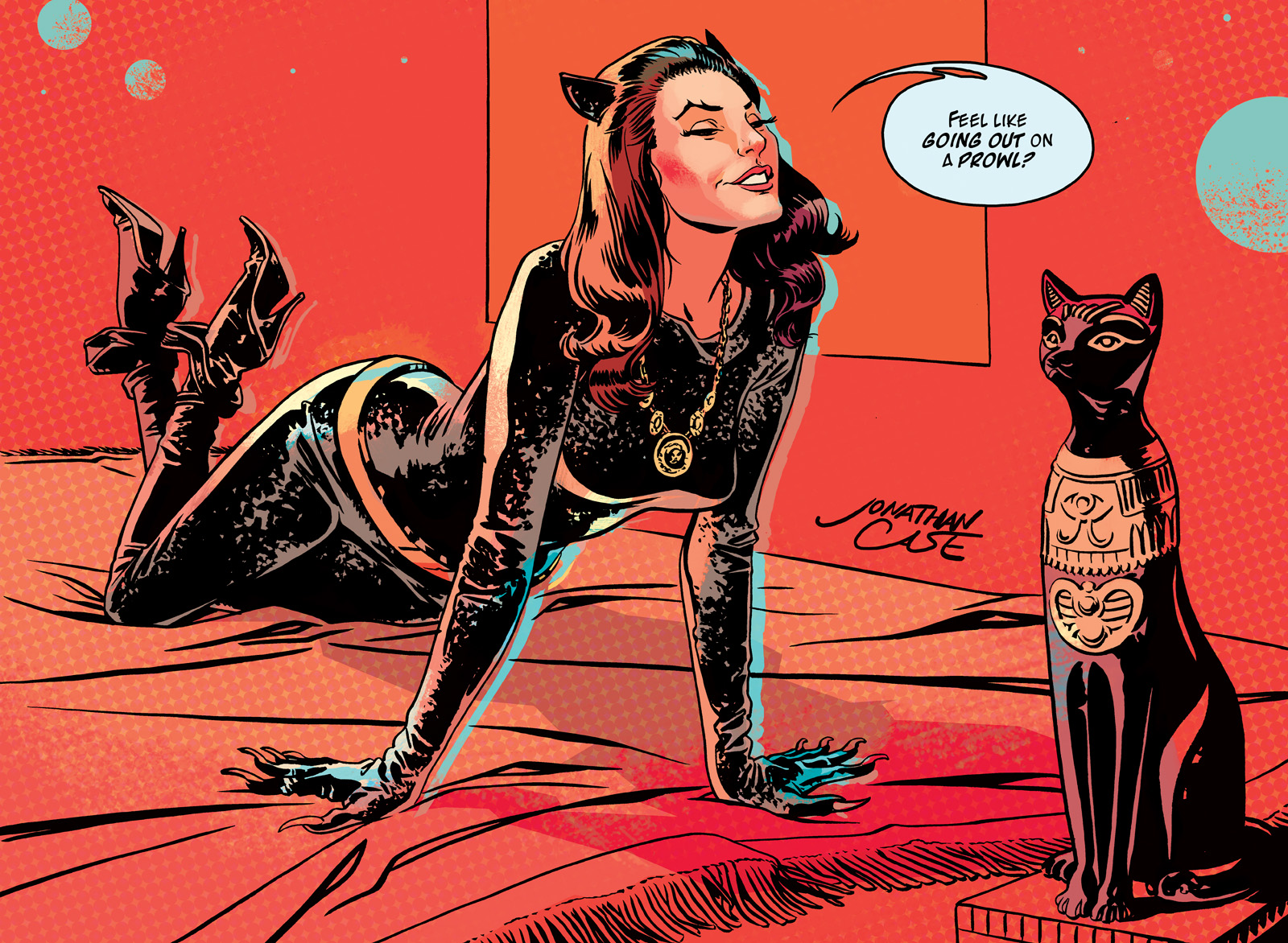
Today I get to announce some really fun news. Really. Fun. Comics. News. My studio-mate and fellow lover of retro, Jeff Parker, is set to write a new series of Batman comics for DC, and I'll be performing art duties for the first three stories, from layouts to color.

This isn't just any Batman though. This is the Adam West Batman, the Batusi Batman, the Julie Newmarriffic Batman. DC licensed the rights to all the actors from the 60s TV show (!), and we're set to start reeling and rocking this summer. Really, if they let me develop with any superhero project, working with whoever I wanted, I honestly couldn't have come up with a better fit: lighthearted, kid-appropriate, retro, and written by one of my favorite comics writers. The script Jeff's writing for this series is gold. You can feel his love the material, the era, the Julie Newmar.

DC announced the project last night at an event in Los Angeles. Mr. West appeared for a signing with the original Batmobile, a replica of the Bat Cave... even Batman cupcakes. Here's the press release. You can see a glimpse of my art at like, 4:13.

BATMAN CUPCAKES.

I really don't need to say more than that.

Julie Newmar Catwoman

If you want more info on all this, head over to DC's site (I think they have a bunch of 60s Bat-stuff they're announcing), or Jeff's blog. As for me, I'm going to start some layouts.

Holy happy circumstance.
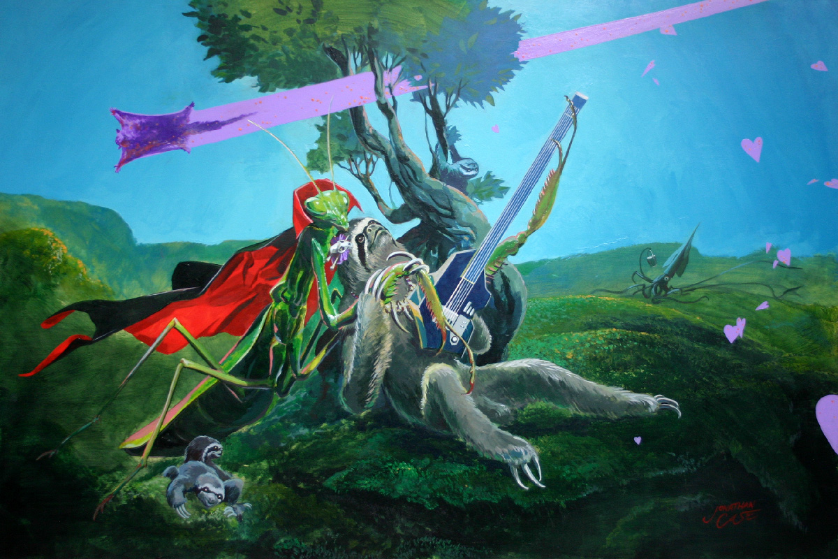
Sloth Love


Every once in a while, you get to do a commission that satisfies all your geek requirements. This one may be hard to top. It has it all: Romance, awesome creatures, a Dracula cape... A land-squid.

I couldn't ask for more! It's projects like this where I'm keenly aware that it's not everyone who gets an all-expenses-paid trip to the Slothlands. I'm grateful.

Also, here's a link to a hi-res version, in case you want some sloth-love wallpaper.

This weekend, I'll be at Emerald City Comic Con, taking commissions (you can totally commission something like this, and I'll mail it to you) and peddling my wares. I may even see if I can get some prints made of this piece.

See you in Seattle!

Live Interview on the Karl Show! (starring Jason)

Wolfman JackTomorrow night: Me, the interview, live, on The Karl Show! (starring Jason), broadcast from The Portland Radio Authority. I get to play DJ for an hour or so, talking about my work and playing some tunes. What sort of tunes? Some that inspired Dear Creature, some that I just like, some that are tailored to give me street cred with people in their 70s.

If you can't catch it tomorrow, they'll post the whole shebang on their website, here. Now I'm off to drink lemon honey tea.

Modern Man Painting

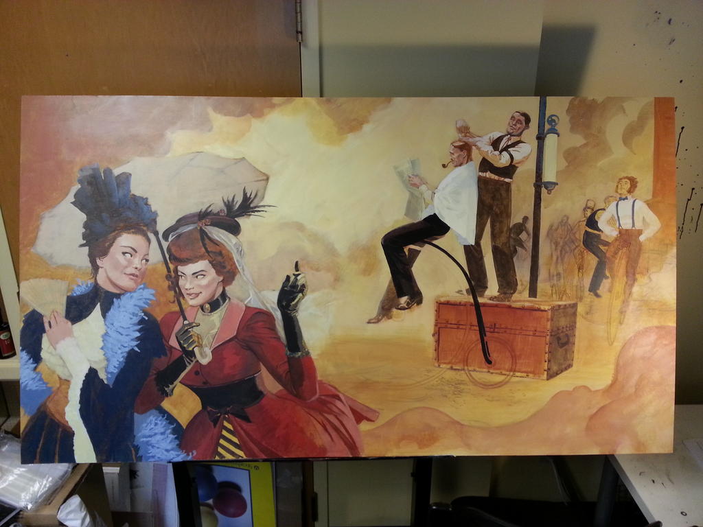
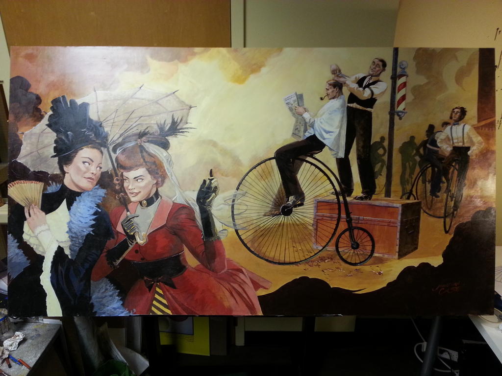
Here's a few process shots from my latest painting for Portland's Modern Man Barbershop. This place is one of my favorite businesses in Portland, and they just opened a new location on Hawthorne (where this piece is going up). Over the last few months, I've become a regular, and I'm just really enthusiastic about the whole business and their aesthetic. Shot of whiskey on your way in, fantastic haircuts, shoe shines, straight razor shaves, etc., and a cigar on your way out. It's a wonderful model, and really affordable (important for the likes of me, who typically goes way too long between cuts). One day I asked the owner, Chris, if he'd be interested in commissioning a painting for their space, and happily, he dug the idea.

I'm not sure when this is going up (above the barbershop's fireplace!) , but regardless, you should head down and get yourself a haircut from these people. It's a lot of fun.

Modern Man (1)

Modern Man (2) Modern Man (3) Modern Man (4) Modern Man (5)

The Creep #2 and #3

Oh dear. Better late than never... I've been under a self-imposed writing rock since October, and a lot of things, like having another two issues of The Creep coming out, slipped by. They both have absolutely terrific covers from Ryan Sook and Tonci Zonjic, respectively. Check them out! There's also a hardcover collection of this series set for release next year (April, to be exact), using that lovely cover from Tonci. Looks like you can pre-order it through TFAW.

Modern Man PDXIn addition to writing, I also completed my largest painting yet, for the Hawthorne Modern Man Barbershop here in PDX. I couldn't be more excited about this, as it's one of my favorite businesses in Portland. More on that, and other bits from under the rock, soon.


The Creep #1 Signing Tomorrow

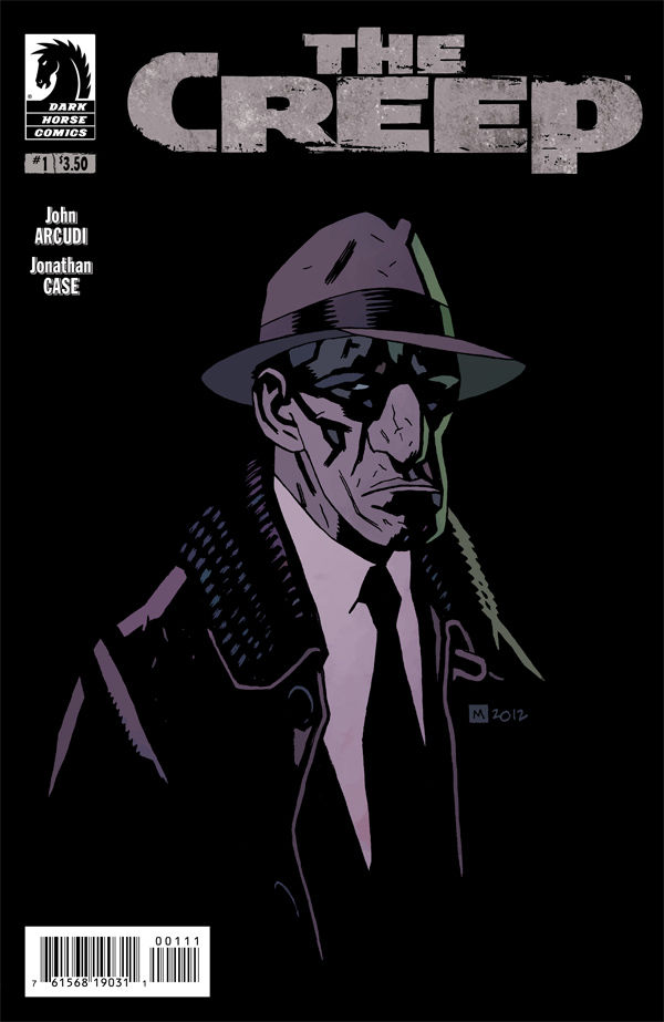
The Creep #1 Look at that! A Mike Mignola cover on one of my books. Like most everyone, I love his work, and feel pretty honored to have it gracing The Creep #1.

Tomorrow, you can pick this up, get it signed by moi, and have a beer and something to eat courtesy of Things From Another World on Broadway and 28th, here in Portland. The party starts at 7— head over here for the details.

Sarah's Painting Complete

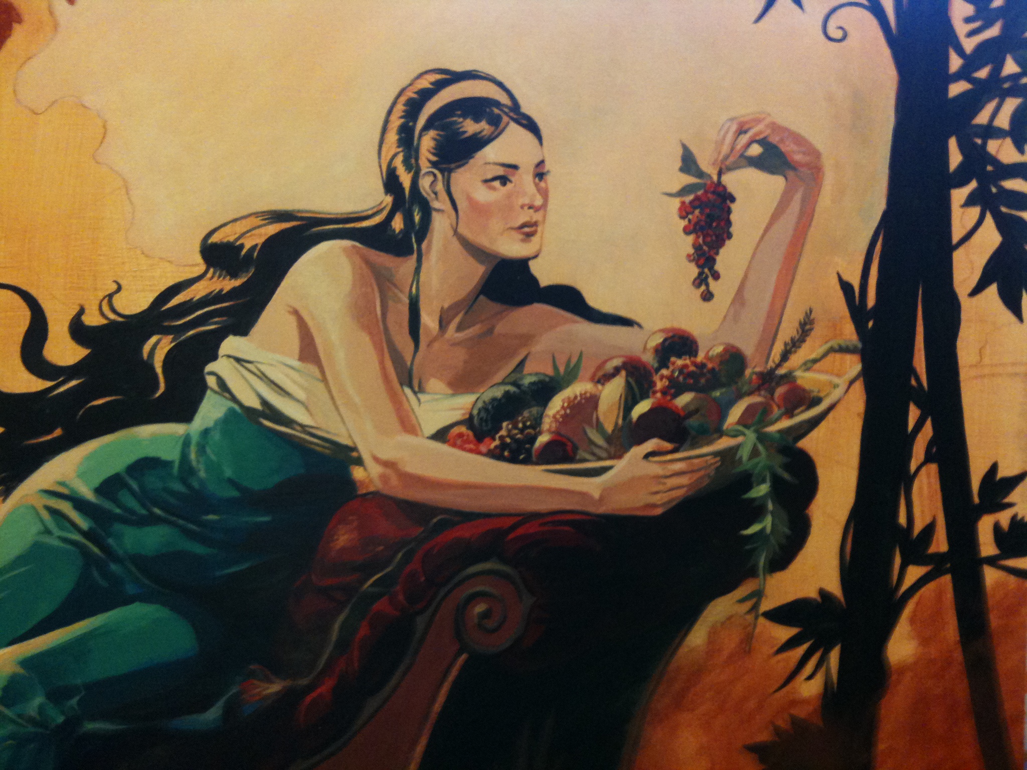
It's done! I set Sarah's painting aside while I finished my work on The Creep, but I just got a chance to lay down the finishing touches. Since it's going up in the living room, it's going to be hard not to take it down and tweak the things that will inevitably start to bug me. Sarah's Painting Jonathan Case

The final pass over the background was mostly about balancing colors, adding in a little more depth, and covering over the underdrawing. I pretty much decided to wrap things up when Jeff Parker's kid was over for a visit and said, "Why are you still working on that? It looks done."

What can you do? Kid says it's done, it must be done.

Fall Commission Preorders

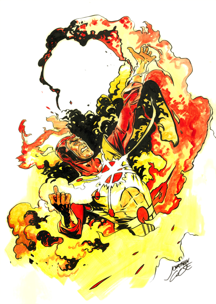
Firestorm, 10x15 ink and watercolor wash, single figure, $120.
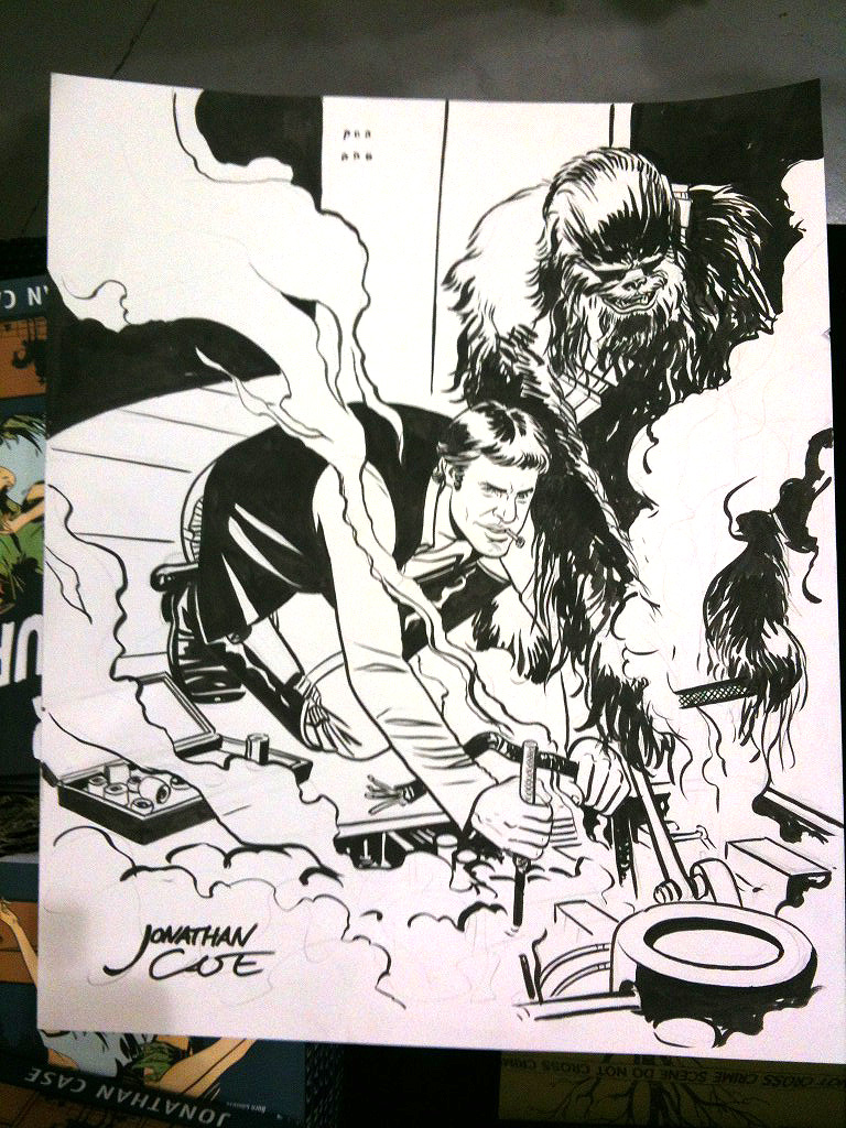
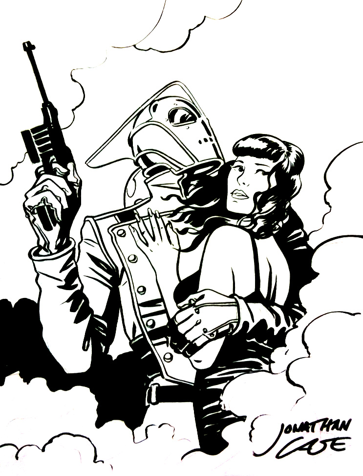
It's fall convention season, and I'm starting up my commission preorders! Contact me to preorder a commission for New York Comic Con (via paypal), or get on the early-bird list for this weekend's Rose City Comic Con in Portland.

Here's the scoop on my rates and options this season.

10x15 (preferred working size)

Pencils (single figure): $50 Inks (single figure): $70 Ink and watercolor wash (single figure): $120

8x10

Pencils (single figure): $40 Inks (single figure): $60 Ink and watercolor wash (single figure): $100

If you want more than one full figure or a pretty involved background, it's just a multiple of my single figure rate. Here are more examples:

Han and Chewie Maintenance, 10x15 ink, double figure, $140.

Rocketeer and Bettie, 8x10 ink, double bust (equals single figure), $60.

Yoda Cuisine, 10x15 ink and watercolor wash, single figure and full background, $240.

See you at the Con!

Jonathan Case: The Creep #1 Signing and Gallery

Creep Jonathan Case

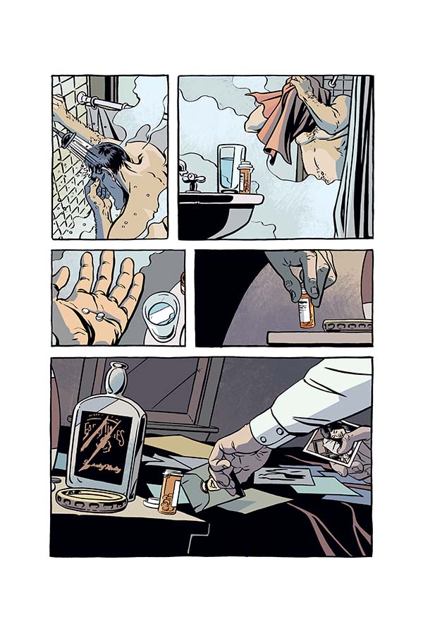
This week, I officially wrapped up my art duties on John Arcudi's wrenching neo-noir, The Creep. And yet ... the world's hardly begun to see it! That changes in September, as issue #1 of the Dark Horse miniseries comes to comics shops, following August's issue #0 (a collection of three segments we ran in Dark Horse Presents). It'll have a fabulous Mike Mignola cover (!) and a sweet release party/signing/gallery at the Portland Things From Another World store (Hollywood location). I'll be there September 12th, from 7 to 10 PM doing the requisite signing, and they'll have a gallery of my work up all month, featuring pieces from Dear Creature, Green River Killer, The Creep, and more. I may even put some of them up for sale. If all that's not enough to get you out there, I have four words: FREE FOOD AND BEER.

If you're near Portland, come out and enjoy swell comics folk, drinks, and 80's neo-noir-themed-hors d'oeuvres. Just kidding. But I wouldn't put it past Elisabeth, the TFAW master of ceremonies. She does it up right.

In related news, I'm happy to hear that a lot of you enjoyed issue #0. You crazy kids, you. Thanks for all the help getting this book noticed. And remember: the more issues of The Creep you read, the more sunlight you'll need for basking in afterwards. I promise.


The Creep #0, Out Today!

Creep Jonathan Case Arcudi

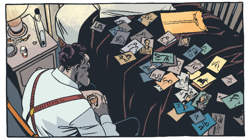
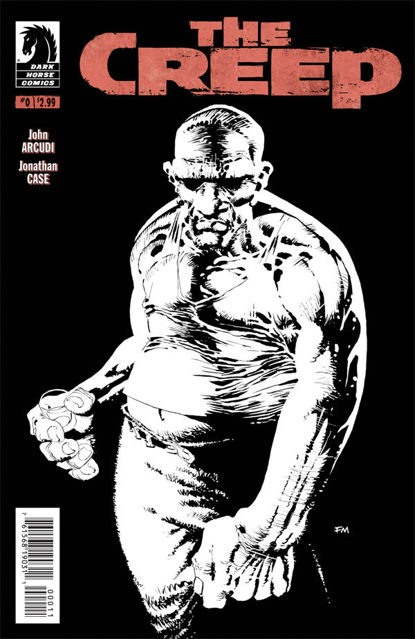
It's Wednesday, and that means new comics! Today sees the first issue release of my project with John Arcudi, The Creep. If you like noir, deformity, unrequited love, and visits from mysterious dream-bears, this is your book. Issue #0 collects the three segments run in Dark Horse Presents, wrapped up with a tidy Frank Miller cover.

Some great people say nice things:

"A beautiful book and, for my money, no one in comics writes better stories about human beings than John Arcudi." — Mike Mignola

5/5 — Comic Bastards

4.5/5 — BAMFAS

Right now, I'm finishing up the last couple pages for the miniseries over in beautiful Pacific City, Oregon (good thing, too, because this story goes WAAAAAY dark). I'm also putting a signing/gallery of original art together with Things From Another World in Portland. Details to come soon.

Between that, Rose City Con, and New York Con, it's gonna be a busy fall.

Eisner Win + Unseen Artwork

Last night the powers that be honored Jeff Jensen and me with an Eisner award for Best Reality-Based Work on Green River Killer. Quite an honor. I'm especially happy for Jeff and his family— their story is heroic in a way you rarely find in comics. To commemorate the occasion, here's some (typically creepy) artwork I did for a part of the GRK promotional machine that just never saw the light of day.

Green River Killer Eisner Jonathan Case

Annnnnnnnd.... I'm sure Jeff did a great job of this already, but since I wasn't at San Diego or the Eisners this time, I'll make my acknowledgements here:

Thanks to our editor, Sierra Hahn, for bringing this project my way and for being tenacious. Terrific job, Sierra!

Jeff Jensen, for telling his father's story with grace, and for entrusting me with the drawing.

Brendan Wright, our assistant editor, for never missing a beat.

The rest of the Dark Horse crew, especially the ones that cleaned up those speckled page scans.

The Jensen family, for their story, their warmth, and the delicious cookies from Mrs. Jensen.

My crew at Periscope Studio, for helping me through everything and keeping me from taking myself too seriously.

My family, for their support and encouragement.

Thanks, everyone!

Portland Monthly — Best of the City

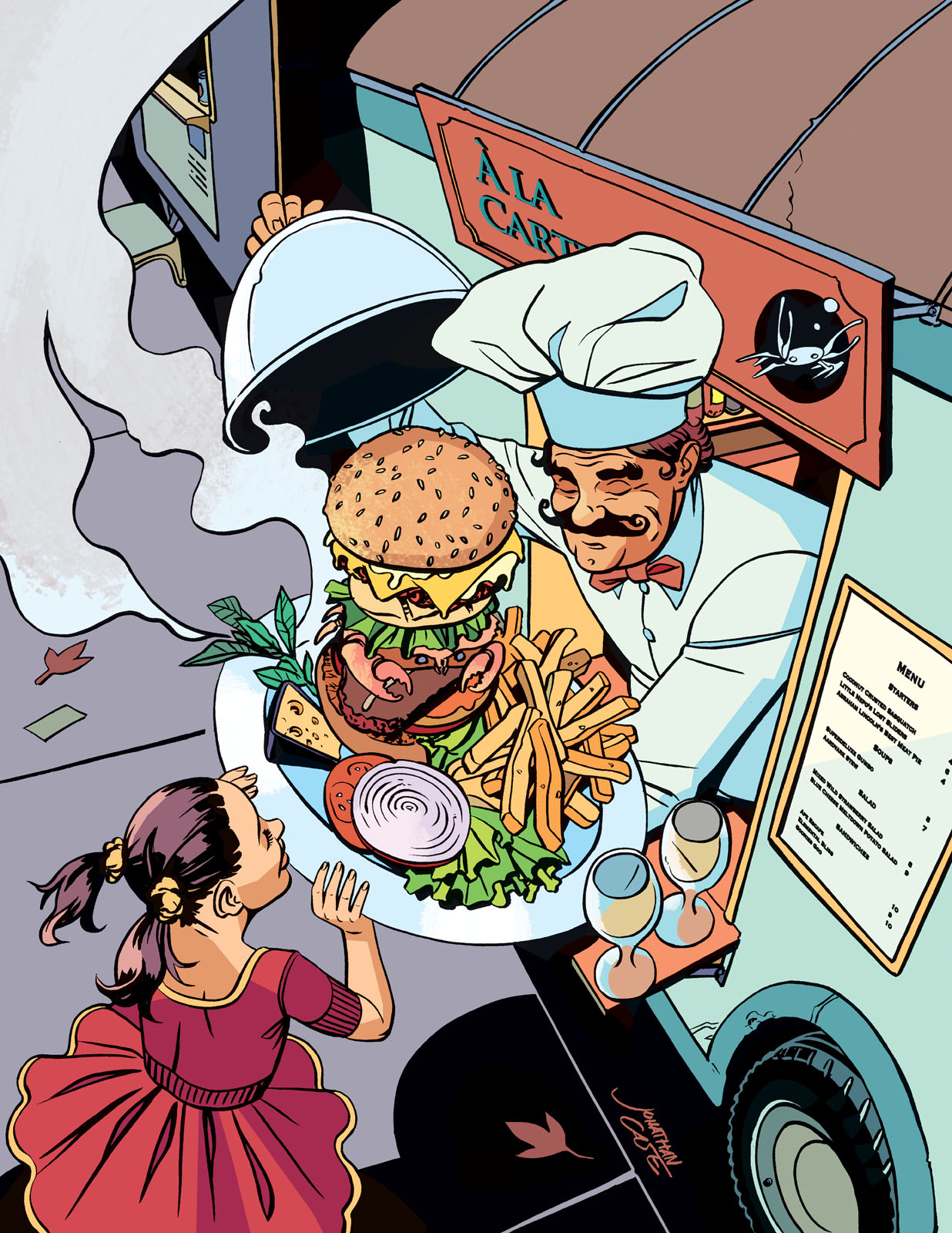
Portland Monthly Jonathan Case Food Here are two more pieces from this spring's 'Best of the City' article in Portland Monthly. Every few years, Pomo runs one of these showcases on Portland's food, shopping, family activities, etc., so it was a definite treat to collaborate with them and show off the city I love.
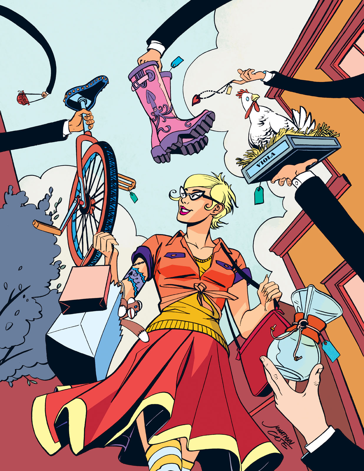
I did six illustrations for them in that issue, and these (Food and Shopping) were two of my favorites. The pieces all started from a notion of transforming everyday Portland moments into fantastical dreamscapes, ala Little Nemo in Slumberland. It was a lot of silly fun, and I enjoyed the chance to help formulate the overall concept.

Portland Monthly Jonathan Case Shopping

This Shopping piece was particularly fun, because I got to pick all these bits and bobs that say 'Portland' to me. If anyone disagrees, well, nyeh. It's all about the squids and sock monkeys. One of my also-ran layouts for this piece had the woman dressed as a pirate lady (as people do here in our fair city, year-round, for their own reasons) but wearing regular sneakers— when LO, behind a shoe-store window, she sees the perfect pair of pirate wench boots. Yeah. Too far out... Perhaps TOO Portland for its own good. It was a fun doodle though. I'll have to see if it's still around somewhere.

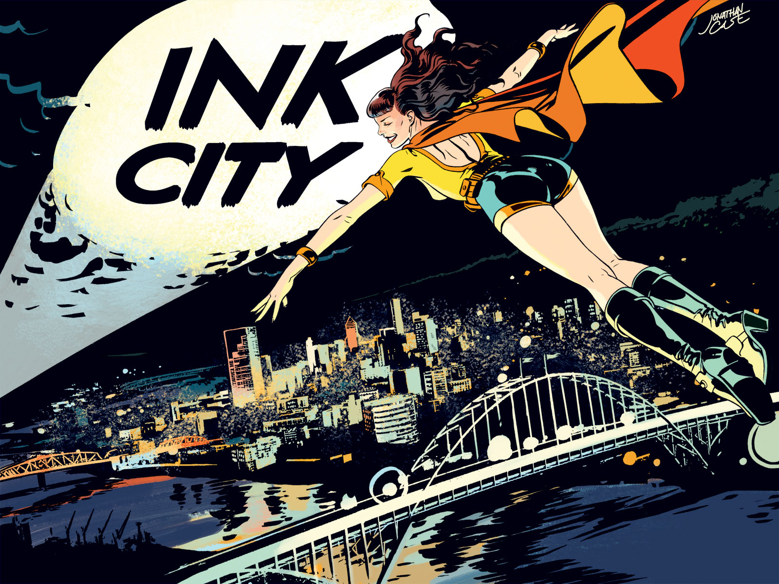
Portland Monthly — Ink City Illustration

Portland Monthly Ink City Jonathan Case Just added this Portland Monthly piece to my illustrations and paintings. This was an illustration for their Ink City article, talking about Portland's thriving comics creators scene. Their article already had a superhero bent to it, but they liked my pitch for a Little Nemo in Slumberland riff well enough to roll that idea into their Best of the City article the next month. I'll post some of those pieces soon.

New Painting, Step Four: Fleshing It Out

A lot of progress today on the overall painting (though a lot of that is unseen here). I'm getting close. I expect the next update will be the finished piece. Today's focus was mostly the scene around her— the fruit, the hanging vines in the foreground, etc. I also did a little more work on her skin, though she's looking pretty chiseled right now... I may ratchet that back some. Tomorrow I'm back to work on The Creep, so I'll have to do a little painting here and there in my off time, but hopefully I'll get to post the completed work soon! Stay tuned.

Monday painting progress

New Painting, Step Three: Major Colors

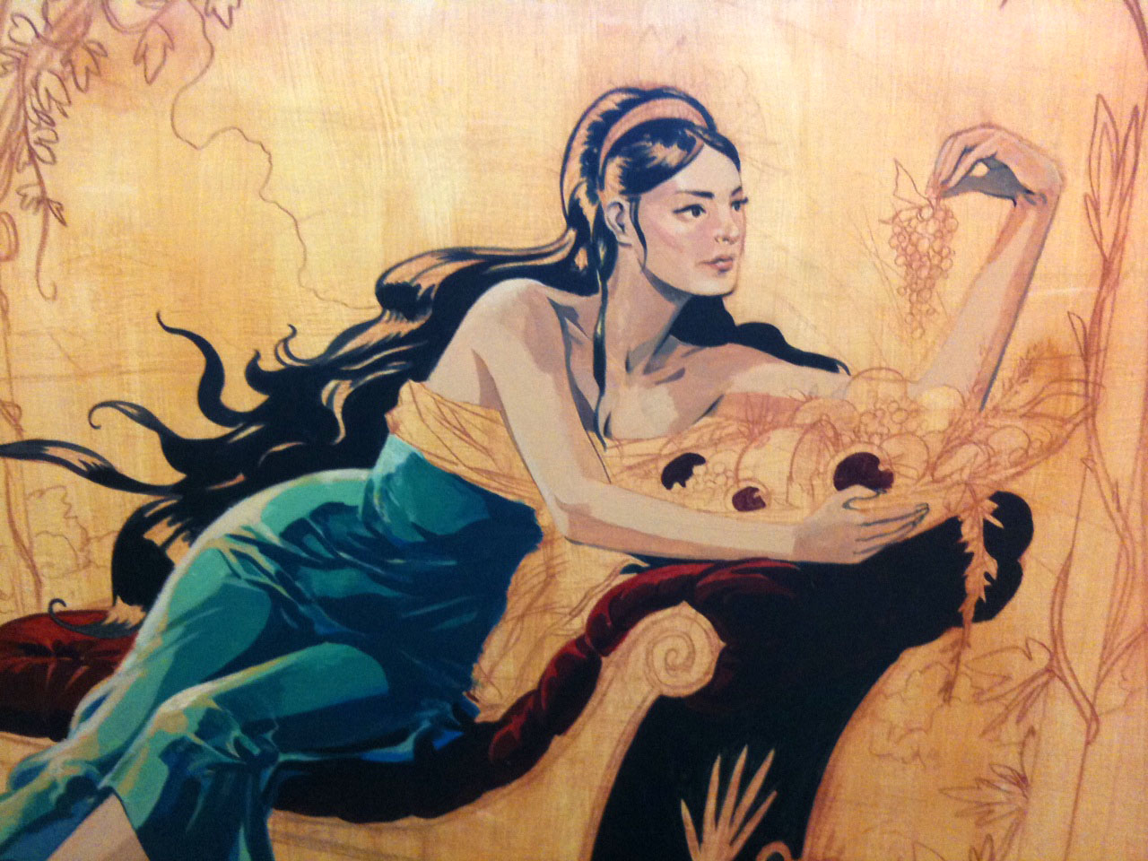
I did get a couple hours to work on the painting yesterday. Not a lot, but enough to get started on the dress and the lounge upholstery. The definite highlight was getting to work again with baby Dorothy in tow. She went in the moby wrap and we bounced around to a record as I worked at the easel. It was a charmed life moment. A later afternoon session saw her a lot more grabby, so it didn't last long. No cadmium red for baby. Saturday painting progress

Right now I'm just blocking in the main areas of color. Some of this will have to be balanced as I progress. I'm feeling like things are getting a little too saturated vs. the skin tone (which almost always happens for me), so I'll probably go over the lounge with a transparent layer of ochre. I'll save that step for later on though, once more colors are blocked in.

More later on!


New Painting, Step Two: Start It Up

Day the second. Time to bring the PAINTING.

So, Sarah made it clear that she's after full color. Sorry, Leonardo. I like the unfinished look of that one thing (and your fabulous blue mask and katanas), but we'll keep your influence a little further away. She also reminded me that she wanted a feeling of 'abundance', with fruit, flowers, etc., as utilized to good effect by Mucha. Fair enough. She pays me in love, she gets what she likes (I like it too)!

Here's one of the images she responded to, particularly its color. She digs the turquoise, so I'll be incorporating that later on.

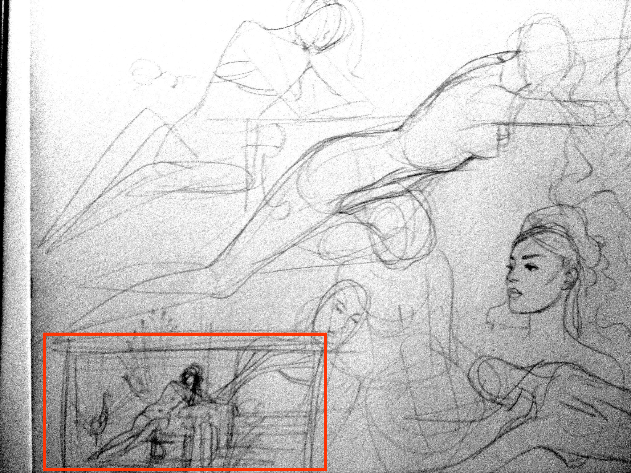
First off, some sketches. I usually vary from painting layouts pretty significantly as I work, but I did find a pose that I liked, and ran with it. Exhibit A.

New Painting Sketch

I also scribbled this face. Vampy McVamperson, Exhibit B.

Vampy McVamperson

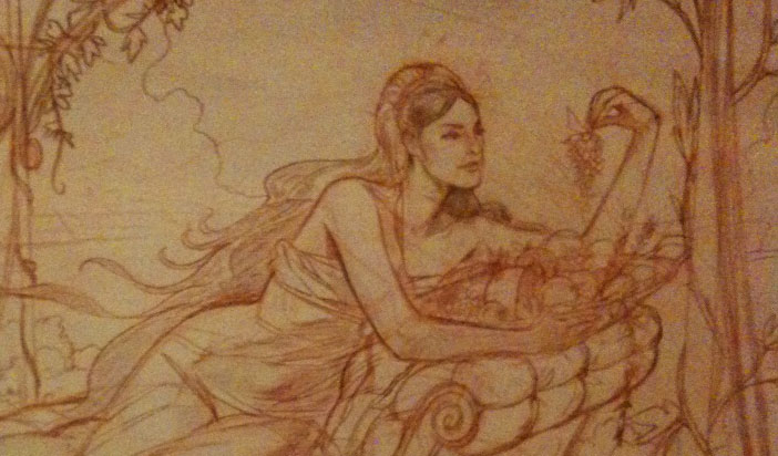
These images are taken with my cell phone for simplicity's sake, so ... forgive. Next up, I started drawing on that freshly gessoed masonite with my trusty red Derwent pencils. These are nice because they avoid the problems of dead-cold graphite showing through thin layers of paint. Everything gets covered over eventually, but it's nice to have a warmer feel to the lines while I'm balancing colors later on. I pretty much always get better results when painting from these. Maybe it's just psychological, but I'll take it. Exhibit C.

pencils new painting

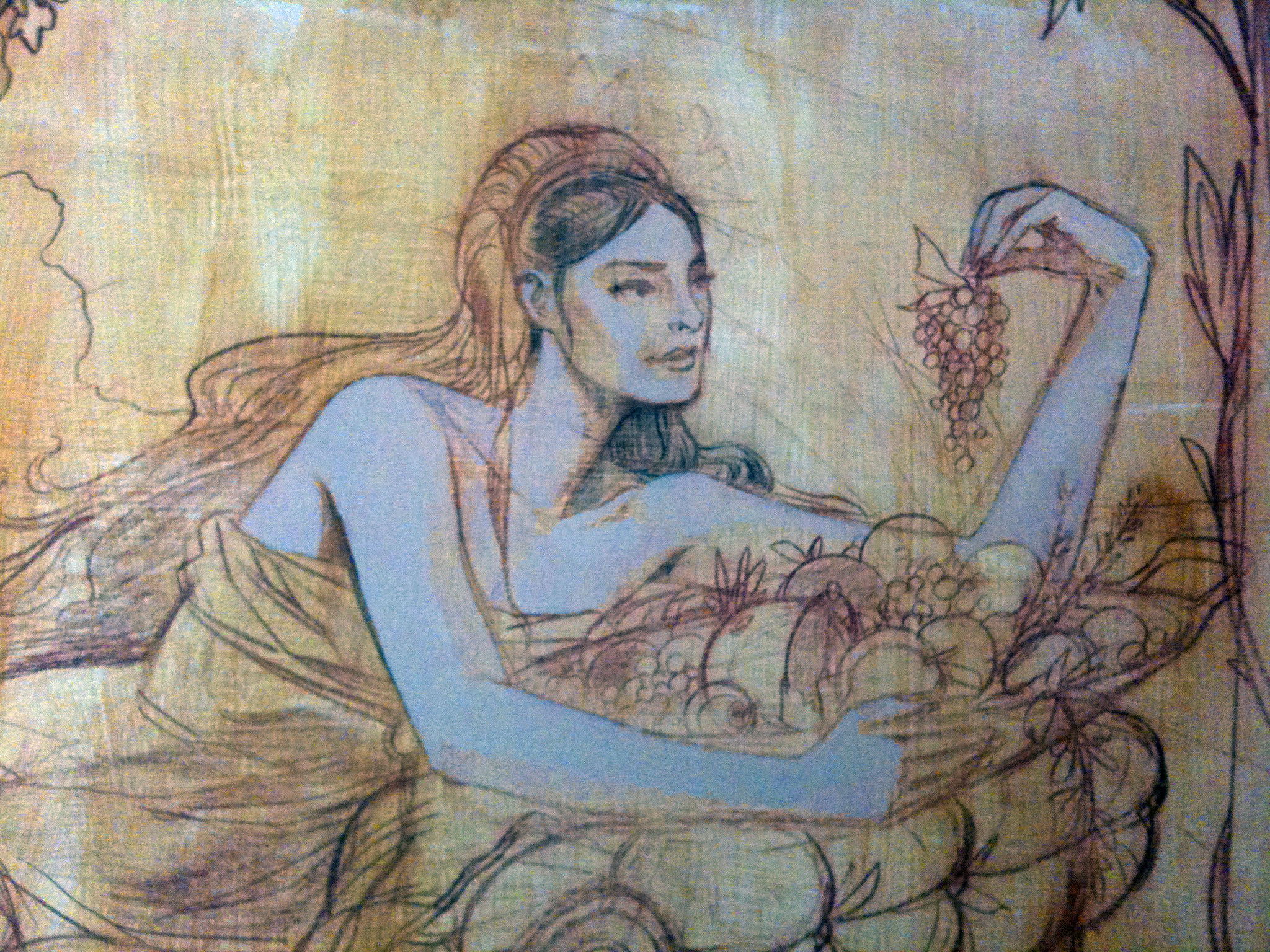
After I got the drawing where I wanted it (a lot of trips to the mirror to check it with the other side of my brain), I laid down a sealing layer of ochre acrylic, matte medium, and flow release (mixed together), let that dry well, and started in on blocking out flesh tones. Ghostly Exhibit D.

starting to paint new painting

Then it's off to the races, laying down more colors and color variations to really carve out her features and frame them with SUPER-NOUVEAU-HAIR. Which brings us to the last image, Exhibit E. The flesh tones aren't completely done, but they're getting there.

Painting New Painting

Once again, my cell camera's bringing me down, but maybe that will help with the big reveal at the end (using a better camera). I hope to make some more progress on this tomorrow, and if so, I'll surely post an update.

Thanks for reading!

New Painting, Step One: Research

I'm in the rare position of having a couple days to dedicate to a painting for my wife, Sarah. She often uses the "cobbler's children have no shoes" line in reference to how little art she has from me. It's been a couple years now, and I'm overdue to put on the good-husband-artist hat and whip something up. I purchased my masonite board this morning, and have a second coat of gesso drying as we speak. I'd show you, but it's just white.

Instead, let's take a look at possible subject matter/reference/points of inspiration.

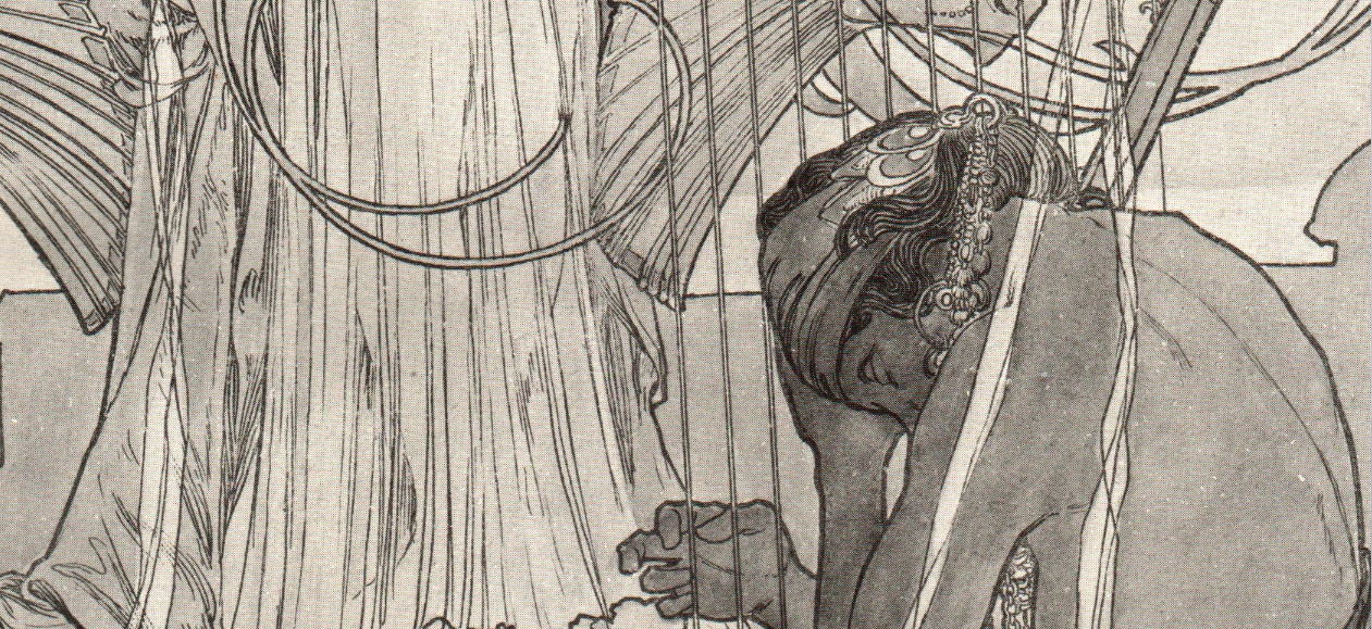
mucha drawing detailSarah wants something in the vein of a Mucha woman with long, flowing hair. That's (I think) all the direction I have so far. I like Mucha. Who doesn't? You may see him everywhere, but he's got a lot of appeal. I have to say, I do gravitate towards his drawings more than his highly decorative finished illustrations. I'd like to keep some part of my painting gestural and loose, so I'll be looking further afield for some of my cues, but Mucha's a starting point.
I thought of asking Sarah to model for the piece, but what's weirder? Having your wife's exact likeness, multiple feet across, hanging around your living room and all done up in a sensuous, Art Nouveau sump'n-sump'n, OR, pasting some other lady's face over all that? I'll have to do some research on that point. See what the patron wants to do.

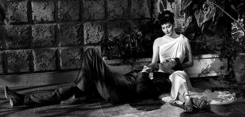
I do know that I want to do something in a landscape format, in an asymmetrical composition. Something along the lines of this Ava Gardner shot. In fact, Ava Gardner wouldn't be a bad choice for this piece (or anything, really).

ava gardner


John William Waterhouse is another example of an artist I could reference in the same spiritual vein, but I'd like to bring in some element of pop art, or just something to loosen it up a little bit. Just a dash so it doesn't get precious.

The other thought I have is to not make it a finished painting at all, but to leave a lot of it in the sketchy construction phase, with deep sepia tones, reds, and chocolatey browns making up the major palette. Like this unfinished piece from you know who. Maybe a little more color, a little more finish in select areas.

Tomorrow I'll have some of the questions nailed down, but this is a start. I'll keep you posted as I head into the mockup and actual drawing.


I Love Gipi

Happy Fourth of July, America. To celebrate our independence from those tyrants across the pond, I'm showing off my favorite non-English European cartoonist. His name is Gipi, and First Second puts out a good bit of his stuff stateside. Fantagraphics, too. I really appreciate a cartoonist that can fluidly construct a figure with a sense of dimension— of really living inside a scene's geometry, while using very few lines. The more you draw, the easier this becomes, but most of us won't ever approach this guy's level of ease in drawing something so loosely, but so well anchored in the rules of perspective. His cartooning skills are closely tied to his work in animation and film. You really get the sense that he knows exactly how everything he draws should look from any conceivable angle. And that's just the start!

His watercolors are gorgeous. He picks colors that serve his cartooning, but also capture light and form with painterly depth. None of the colors dominate and call-out, "Hey, I'm a focal point!" Everything's in service to a brittle line that never belabors its subject, but gives just enough. He suggests, and invites our imagination to contribute the rest.

It's always scary to meet the people you admire, but one day I'd like to shake the hand that channels this amazing, unforced way of seeing and thinking. It's sort of miraculous to me.