April 2nd is Batman '66 Day

You know why it's Batman '66 Day tomorrow? Three things. 1. I return to the series with the first of 3 loaded new chapters, enhanced for digital. This one has it all, as Jeff Parker says:

For our latest story, artist Jonathan Case who kicked off the series, is returning for another big three-parter where The Joker and Catwoman bust out of confinement and turn Gotham City upside down.

It's wild and crazy, and I'm doing the primary cover for this issue (#11) when it's all collected for print. Here's the original cover art (for sale, and still in support of trafficking survivors).

Joker and Catwoman

2. Tomorrow's the release of the first snazzy hardcover collection of Batman '66. It really turned out beautifully, and includes art from fab people like Colleen Coover, Joe Quinones, and more! Buy a signed copy here.

 20140401_165945

3. The incomparable Jeff Parker will sign the above next to yours truly at Cosmic Monkey here in beautiful Portland, OR. 5PM-7PM, Wednesday April 2nd. Head over here for event details. Visiting comics stars Declan Shalvey and Jordie Bellaire will join us too and sign their hit book, Moon Knight.

And we may get burgers at Sassy Burger if I can convince them. Those are good burgers.

I'll also bring some of these Julie Newmar Catwoman prints:

Catwoman

I rest my case. Batman '66 Day.

Latest Hardware Love Letter - Canon Pixma Pro 100 Printer

My love affair with tech is frequently at odds with my impulse to keep rooted in the materials of my childhood (and, history up to now). There are uses for both. There's efficiency to be gained in digital, and there's joyful play that goes with using real-world materials. I still prefer and approach to my work that balances the two, and gives me the best aspects of each: the speed and power digital layouts/pencils, and the natural textures and fun of traditional inks (and sometimes paints). In order to bridge the gap between my Cintiq Companion and my bristol board, I needed another tool; a quality large format printer. I did a good bit of research, and I've found one that not only fits the bill for comics bluelines, but a whole host of other applications (art prints, photos, last-minute valentines)- and in my use, it does it all while beating the competition senseless from a quality/value standpoint. Here it is: Swoon.

This is the Canon Pixma Pro 100. It's Canon's entry-level professional color printer, it's beastly big/heavy, and built like a tank compared to the consumer printers I've used. I'll get into what it does well in a minute, but first I'll tell you something about my prior experiences using large-format printers. Then you shall fully understand my joy.

I've used a number of large format printers from HP, Brother, and the like (and by large format, I don't mean gigantic, roll-out-a-banner size, just something with at least 11"x17" capabilities). They've all been consumer-grade, and serviceable with some coaxing. One that comics people recommended frequently for its multi-functionality is the Brother MFC J6710dw. For about $150, you get an 11"x17" scanner, printer, fax (right?), creature-feature. We have one in my studio, and I've used it a number of times to print my digital bluelines onto bristol.

We are not friends, you and I.

Here's the thing: in the mid-to-late nineties, my parents got one of these MFC things from another manufacturer, and it just did nothing well. It had constant problems, and at that time, I swore I'd never buy an MFC device. After using the newer Brother in my studio, my opinion is largely unchanged. It does produce decent blueline prints, but with enormous caveats: after only a few friendly encounters, I found it had trouble taking a single page of bristol (you have to hand-guide the paper onto the sensor, do a holy cross, close your eyes, and count to ten- and even then, it may spit the board out, or give you lip about how there's nothing there). Even when it does finally print something, it may print the image slightly crooked on the page- not a big deal for print art production, but it sure doesn't make originals look their best. In short, I found all the efficiency gained in digital layouts and pencils squandered by constant printer battles. I sometimes spent an hour, hour and a half trying to get ten pages printed. I'm not kidding. I could have had another hand-penciled page mostly done in that time. RE-DONK-U-LOUS! My experiences with our older HP deskjet were largely the same- lots of time wasted trying to get a good print.

So where do you go from there? Large-format-capable pro grade printers, even entry-level ones, typically start at about $500. Ouch. Would I eventually make that up if I didn't have to waste time battling the device? Sure, but I am my father's son, and can't help but find a deal. This is freelance art, after all. Some days I get offers from joe average that let me pay two weeks of bills in a day, and other days I get offers from major publications to do art for less than I pay my babysitter. Finding a good deal on your tools is important.

Enter the Pro 100. One of the delightful things about this printer is that it's almost always available with a huge rebate from Canon. If you go to Adorama, for example, you can typically find it for under 90 bucks after the $300 mail-in-rebate, including a nice stack of 13"x19" photo-paper. It's crazy.

Here's what's even crazier. We all know that manufacturers price their printers to make their real money from ink and toner sales. This model is no exception, with a full set of 8 cartridges running about $100. Double-ouch, especially considering how much ink you use on just 5-10 13"x19" high-quality prints (the answer is most of it). Granted, blue-line prints are nowhere near that thirsty, so you'll get far more pages out of the ink set before you need a refill. BUT. The secret to getting huge value out of this printer is using refillable inks from a third party manufacturer. Note, I'm always very leery of non-name-brand inks, and you should be too. They'll often yield less, clog more, and give you worse color. I did a lot of research on this, and found a supplier called Precision Colors that a bunch of pro photographers love (I think I found a few discussions on DPReview, among others). Their system is certainly more work intensive than just buying a new set of cartridges, but having done it myself now, it's really very easy if you follow their instructions and have a few tools around the house. I also love that I don't have to throw away so much plastic.

Squeezy caps make for cleaner refills.

The set I bought from them is the squeezy-cap system (should be on the bottom-right of this page). Do your own investigating to see if this is worth it to you, but for me, it's beautiful. The inks are formulated to match the quality and consistency of Canon's, and with the bottles I bought, I should be able to fill my cartridges about 3 dozen times for the same price of 1 new set from Canon. Precision Colors also has adjusted color-profiles you can download if you're crazy about getting everything perfectly consistent. For my uses, their inks work perfectly well with the default Canon settings.

The Pro 100's print quality and ease of operation are also big plusses. Coming from the Brother, I expected some amount of fiddling would be necessary for my bristol sheets, but much to my surprise, I've not had a single battle in a month of regular use. I can load up a fat stack of bristol sheets, hit print on a batch of pages in Manga Studio, and the printer just does its thing, no lip given, no jams, no misaligned images (knock on wood). The bristol feeds through automatically. I also used the printer for some art prints at a recent convention, using the provided 13"x19" photo paper, and the results were stellar. As good or better than anything I've received from a print shop, even on the standard quality mode. Its borderless  printing feature is also useful for art prints, or just getting the biggest working area possible onto my bristol board. The printer's wifi capable too, so I can sit at my desk/couch with the Cintiq Companion and print stuff off any time, without having to hook anything up. A pretty standard perk for a modern printer, but still very nice.

So far, I've printed about 30 pages of Batman '66 pencils, a couple watercolor underdrawings (I've gone right over the ink lines without much bleeding), maybe 10 convention art prints, some smaller photos, and a handful of other things (last minute valentine). I'm very pleased with the Pro 100 in all aspects. If you have limited space, that's a consideration, as it really is large and heavy. Otherwise, go snag one from Adorama, or wherever has the best price, and print yourself silly.

My crappy cell phone camera can't do these justice- but look at the size of that Caspar David Friedrich! Borderless goodness.

Where Monsters Dwell Interview

Tomorrow I have an interview on radio/podcast Where Monsters Dwell. I'm going to do my best to rally through this cold. Get ready for some sweet, sweet, frog-voiced action. Looks like we're talking Batman '66, SARC donations, and about Jeff Parker (because I like to link to his blog). If you want to ask me a question, it looks like they even have a section for that. I'm prepared to tell all.

Original Art for Survivors

start copy

sarc

Today begins a new partnership with some people I really admire. Here's the plan:

Every month, I'm donating a portion of my original art sales to SARC (The Sexual Assault Resource Center), my favorite local nonprofit serving survivors of sexual exploitation and violence. This month, I've already contributed $535 out of a possible $1,000. For December, I'll do the same, up to $1,000. Whether it's a couple pages of Batman, a color cover, whatever, the first $1,000 goes to SARC. Pretty simple. I'll start with this model and see how it goes. My intent is to raise funds and awareness for their work throughout next year.

Browse my Original Art section here.

(UPDATE: In less than 24 hrs, I've met my goal of $1,000 raised for SARC. Thank you!!!)

SARC's been around since 1977 (they're featured in this year's Willamette Week Give! Guide). Begun by two assault survivors, its staff works in the Portland metro area with a current caseload of almost 300 kids at risk for sex trafficking. It's the same population the National Center for Missing and Exploited Children talks about when they quote stats like this:

Every year in America, there are between 100,000 and 300,000 children at risk of being sold on the sex-slave market. The average age of the victims is between 12 and 14.

Globally, human trafficking is the #2 most profitable illegal business; just ahead of weapons and just behind drugs. It's really difficult to let that sink in. I'll leave it to you to follow the sources below if you want detailed information; suffice to say, I can't think of an issue that needs more support, and has less. Nationally, there are fewer than 100 beds in treatment facilities equipped to help heal and care for these kids. One of the social workers at SARC said that for every girl they take on, that girl can name six or seven others being actively prostituted. It's staggering. Nonprofits like SARC are on the front lines providing care, services, and protection, but they're hugely under-supported, especially from your average American guy (hello).

I've supported SARC financially for a few years through the Epik Project, and I want to do more. Because of who I am and what I do (an artsy guy with limited real-world skills), my options for helpful involvement are limited. This also just isn't a topic that comes up naturally in any social setting. Believe me. I've tried. Taking stock of my options to do more, I landed on art sales. Original art income is totally unpredictable; I can't depend on it to pay bills, but I can use it strategically. It's a natural fit for donation.

If this all seems a little bizarre and non sequitur coming from a comics creator, have a look at this: other cartoonists like Lora Innes and Crystal Yates are already at work on this issue. Their organization, Comics Creators for Freedom, has already raised over $20,000 to assist survivors. They've set their latest fundraiser for December 2013- it's inspiring stuff.

If you want more info on human trafficking, check these out:

Government info pages/resources

Nonprofits on the front lines (some local to me)

Donate directly to SARC here: 


Batman '66 Original Art - #1 Variant Cover and More

Batman 66 Launch Art Previews Variant

I just listed all my remaining pages of Batman '66 #1 on my original art section, including something special:

This is the series' launch art, also used as the cover for Previews (May, 2013), one of the two variants for issue #1, and who knows what else. Seems like it was everywhere for a couple months. Also up for sale are a few of my favorite pages featuring Julie Newmar Catwoman kicking Frank Gorshin Riddler's butt. Check 'em out.

Speaking of Batman '66, Jeff Parker just sent me script, so I'm officially on board another 30 page installment. I start layouts next week! It's going to be packed with everyone's favorite villains, celebrity cameos, the works. I can't wait to get under way.

If you'd like to purchase any of the listed art (or even something I haven't listed yet), drop me a line on the Contact page.

Cintiq Companion Review -Surface and Note 10.1- FIGHT

wacom-cintiq-companion Techno-nerd-wise, this was an interesting month. Our neighbors to the north, Wacom, (in Vancouver, WA), got in touch with me to test their Cintiq Companion for a few weeks and give them feedback/bug reports. At first I thought they'd given me a prototype, but it turns out mine is one of the production models. The fact that it's now my own, my precious, and that it's the same hardware that you, gentle reader, would be purchasing, means the flood gates are open, and I can tell you all about it. How it compares to my faithful Surface Pro, and even a little reference to the new Galaxy Note 10.1 2014 Edition (jeepers, that's a mouthful), which Samsung sent me (thank you). There are a surprising number of people asking for comparisons between the Note and these full-powered PCs, so I'm happy to tell you what I think.

Let's talk Cintiq Companion. When Wacom finally announced it, the first thing people said (as they do) was, "Wah, $2,000+???" Let's look at it this way, and move on: any manufacturer, be they Sony, Microsoft, Fujitsu, etc., charges a premium for a premium spec machine that will not offer drastic real-world performance gains (for most people), over something like the baseline Surface Pro (2), which starts at about a grand. If you load up a comparable Sony machine like the Duo 13 with an i7 CPU and 8GB of RAM, guess where your price point lands? North of 2 grand. And for those who feel they need 8GB of RAM to make their work lives easier (me), just having the option is huge. With the Companion, you're paying dollaz for a pro-spec machine, and one with some serious user-interface advantages for art creation. That's the gist of it.

That leads me into the heart of things; the machine and its interface. Some of what I like:

The build quality is very good. It's heavier than the others I mentioned, but it feels solid in your lap, and the surface area/bevel really works well for its primary purpose as a drawing device. The funny thing about the Note 10.1, by contrast, is that it's lighter and slippery(er), and I really need to set it on something solid for drawing. The Companion stays in place, thanks to rubbery grips, and yes, its almost-four-pound weight.

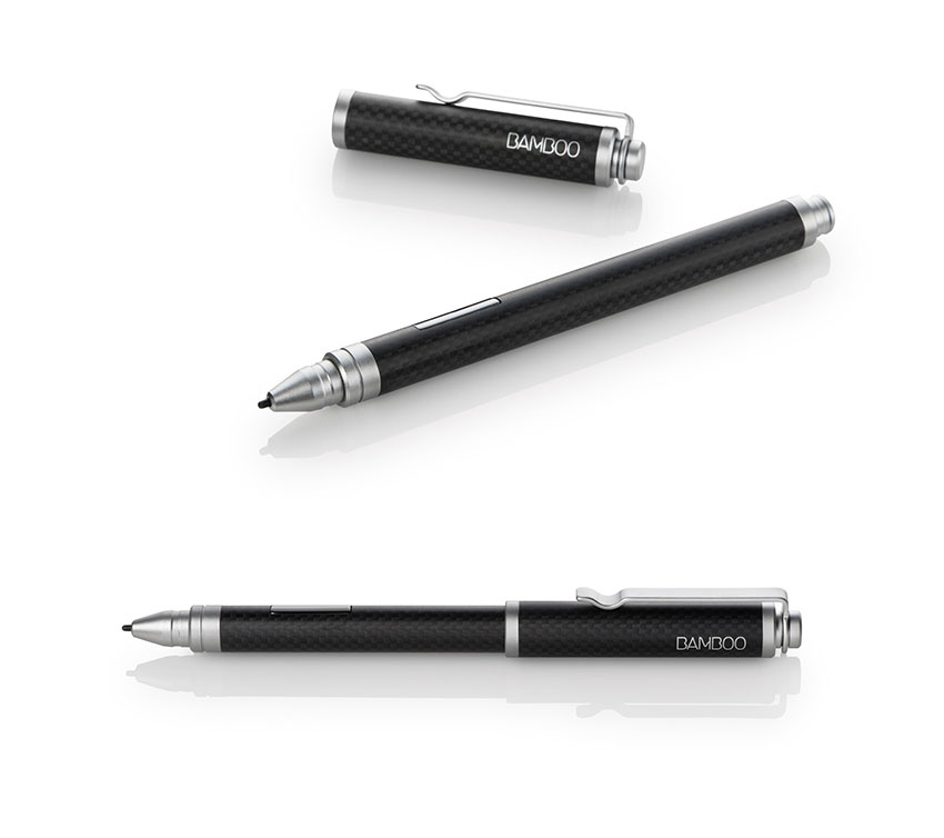
The surface of the screen also has enough tooth to make drawing a more controlled experience. It's hugely helpful to getting a stroke right the first time. The pen itself is comfortable, and obviously better suited to extended use than the stock Surface or Note 10.1's pen (or the Bamboo Feel I bought for the Surface Pro). Plus, you get additional control with the Companion Pen (buttons, tilt, pressure sensitivity). Tilt, I don't really use (it's often too processor-intensive for my canvas sizes... lag city), but the extra button and the pressure sensitivity are definitely helpful.

Other things that add up:  Battery life is surprisingly good (6-7 hours for twiddling your internet thumbs, about 4 for drawing/working). Two USB 3.0 ports instead of the usual one. The optional bluetooth keyboard has great key action (much more accurate/comfortable typing experience vs Surface Pro), is quite low-profile, and it's USB rechargeable (nice). I've actually spent more time writing script for my next book on the Companion than doing anything else (SUE ME), and I've really enjoyed the little keyboard. The Companion's included tote bag is also very nice (look for it hidden in the packaging, I missed it the first time).

Yeah, but can he do THIS?

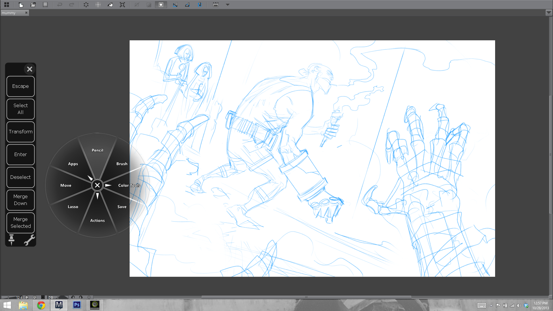
The physical buttons on the bevel and pen go a long way to getting work done efficiently minus a keyboard. For pro applications like Manga Studio and Photoshop, that's a big consideration for those who want real mobility with a device like this. I previously never strayed much from keyboard shortcuts, even with my old Cintiq 21", but because I lacked a keyboard for a while with the Companion, I took time to configure everything and learn what I could do with Wacom's buttons, Radial Menu, and software touch-strips. I came away impressed, and happily efficient in my workflow. That's something you can't do as well with the Surface Pro, the Sony Duo, or the Note. Yes, I made that lovely lap-board to support the Surface's keyboard (wistful sigh), but then its overall weight and footprint is as much or better than the Companion's. I still like my homegrown solution, but the fact is that Wacom designed their Companion with art creation in mind, and the others really did not. There's an appreciable difference in both the feel of getting work done, and in the speed of getting work done when you're on the go, without your keyboard.

The screen is very good. 13 inches is a good compromise for portability/usability, and its resolution is just as sharp as you'd want it to be for graphical interface use (something of a struggle on the Surface Pro). A quick side note: Manga Studio's latest iteration (5.03- free update for people who own 5.0+) has a scalable tablet-friendly interface option that's worth checking out). Colors on the Companion are more accurate than my Surface Pro (not sure about the Pro 2, I know they've made big improvements in their color fidelity).

Those are a lot of the good things, and they make the Companion a great solution for my needs. That said, I've been testing this thing for a month, and I have a clear sense of its faults, some of which may be fixed with software updates. Bear that in mind as you journey with me, into the realm of Nit Picks.

Things I don't like:

The stand functions well for what it is, but what it is is hardly mobile, or very well designed. It seems to me that in V2, Wacom could easily incorporate a multi-stage stand into the device itself without adding much weight, and still retaining the rigidity and strength needed to rest your arm weight on the thing and have it stay put. It's a design challenge, but not an insurmountable one, especially as the computer components themselves shrink with future generations.

I dunno, man.

Another weird bit is the power button. It's placed right where I touch the device to shift it in my lap, and because of the button's design, it's easily depressed, putting the Companion to sleep (by default- you can change it in the Power Button options in Windows 8, but your shouldn't have to). There's a handy spring-button on the other side of the Companion for locking screen orientation. Making the power button something more like this would solve the problem. It's a weird oversight.

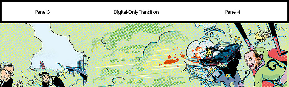
Also annoying is the inability to use this machine as a drawing display for a different computer (ie, a much more powerful workstation). Wacom EU's FAQ on the device says it's a limitation of Windows hardware, lack of interest from consumers, yadda and yadda. I really think this could, and should be done. It's not even about being able to use the device when its hardware is out of date, it's about using the device right now for applications that need more power than it can muster with its own internals. This uses a ULV processor, of the same ilk as the Surface Pro. The i7 vs i5 means you'll see maybe 10% additional horsepower. That's not as much as some people may be expecting. These machines are plenty fast for most illustration purposes, but just as I run into limitations on the Surface Pro, I run into similar limits with the Companion. They both comfortably process 11x17 600 dpi color files with a good number of layers. Double the canvas size, though, as I need to for Batman '66's digital edition, and things bog down. Again, that's a fairly small fraction of my work, but it's an important one. I'd like to either have a full-voltage chip inside this thing, and/or the option to hook it up to a much more powerful PC when I need to cut through a jungle of giant art files. Quick note: If you find brush strokes lagging on the Companion, make sure you have its power mode set to 'High Performance', not 'Balanced'. Click the battery icon and select 'More Power Options' to find it. 

Finally, there are a few quirks with drivers and software that could be improved. Touch and gesture support is the least configurable of the Companion's typically robust control-set. It's also the most finicky. Bringing up the software keyboard, for example, often de-registers the cursor in a text field, forcing me to bring up the keyboard, then tap the text field again to start entering text. A small annoyance, but it's there until they fix it in future drivers.

Driver and software issues may not happen to everyone in the same measure they happened to me, but they're part and parcel of a first-gen device like this (and, let's face it, most Windows devices), so you should approach a purchase knowing you may need to sort through a few more software woes than you would with something like the Surface Pro, which comes straight from Microsoft (still, that machine isn't perfect either).

---------------------------------

So there you have it: the good, and the not-so-good. In the end, I feel the good of this machine far outweighs its faults, and I'm very happy with it. My wife now has the Surface Pro, and I'm forging ahead with my digital art creation using the Companion. It feels good, it functions well, and it's by and large a thoughtfully designed art tool. It has plenty of room to improve, but so do the other options. If you're a professional, the Surface Pro 2 with 8GB of RAM is a compelling option, but one lacking the interface and form factor considerations of this machine. With the Surface, you really have to get the keyboard and find a way to use it on a flat surface, whereas the Companion can function pretty well without one (for art). Comparing them that way, you're looking at saving about 500 bucks if you go the Surface route, barring warranty and some extras (these mostly in Wacom's favor). To me, the Companion is worth it. If you're like me, and your file sizes are too large to make the cloud a viable means of working in the studio and at home on multiple devices, the Companion may be a very good solution for keeping everything with you, anytime and anywhere you need to work.

Note_10_Samsung

Then there's this little guy. Isn't he darling? That lovely screen, that lightness. It's a nice tablet.

The Note 10.1 is less money yet than the Surface and Companion, and also less useful in its capacity for getting work done, or drawing something easily/accurately. It's a totally different piece of hardware, nice for media consumption and a doodle/rough, but in no way capable of being your only computer/digital art device. Drawing on it is a bit laggy and inaccurate; I was surprised given its specs, but my Galaxy Note 2 phone actually draws and navigates with less lag. Weird.

If you have questions about the hardware I'm reviewing (and I know you do, based on my Surface Pro review), I'm glad to help. Google probably knows better than I do (and is faster at responding), but I'll do what I can.

Til next time!

Batman '66 Original Art For Sale


Batman '66 Original Art

What a lovely Wednesday morning.

Last night at midnight, two things went live: My last Batman '66 story of the year (Mad Hatter Part 2) and a new sales section for original art, with the first few pages of Batman '66 Issue 1It looks like the first two of six sold while I slept, so cheers to all you Bat-fans. I've had tremendous interest in the original art for this series, but it's taken me a while to feel alright parting with the art. It's sort of become one of my babies.

Batman '66 Mad Hatter Part 2

All that said, I'm excited to share some of this terrific book with you. I'll post more pages throughout the next couple months while I start my next graphic novel for Dark Horse (Yes!)--- then it's back to Batman '66 in November, and more exciting developments in the new year. If it sounds like I'm pleased... I am.

Also, Rose City Comic Con's coming up fast! I'll be there, next to everyone's favorite down-home mastermind and Batman writer, Jeff Parker. I'll bring more original art, and will be taking commissions too (already filling up my queue, so contact me to get a spot early, just in case).

Happy Wednesday, everyone! I hope you enjoy today's Batman, or as my baby girl calls it, 'That-man and Christopher Robin'.

Siren Serenades Batman, Out Today

Siren  

The latest Batman '66 #6 is out today, and even though it's not digitally super-enhanced and sort of bears the mark of the beast, it does have some of my best work on the series. I hand-painted a few pages where things get really trippy, and writer Jeff Parker really outdid himself in giving me craaaaaaazy fun stuff to draw this time. It's my personal favorite so far.

At Comixology for 99 cents.

This Guy Made an Awesome Surface Pro Lap Board


Jeff Ketter at Icono Blast took my Surface Pro lapboard design and made his own (beautiful) version. It looks extremely slick! He took the time to really polish it up and make refinements to my original design, and I dig his additions (camera hole, mouse-pad grip, jet black finish, etc...). If you're looking to build a lap board, you should definitely check out his detailed post.

Nothing like a little shared Nerd Joy to start the Monday. Thanks for sharing, Jeff!


Batman '66 #1 in Stores Now

Batman '66 Print 
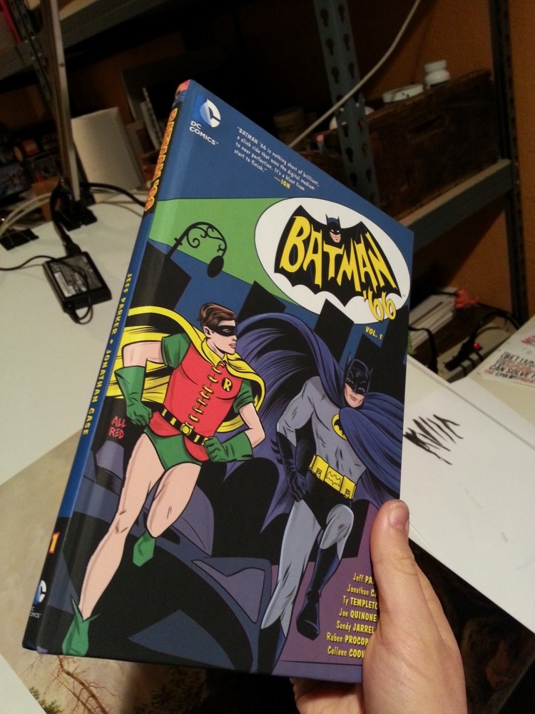
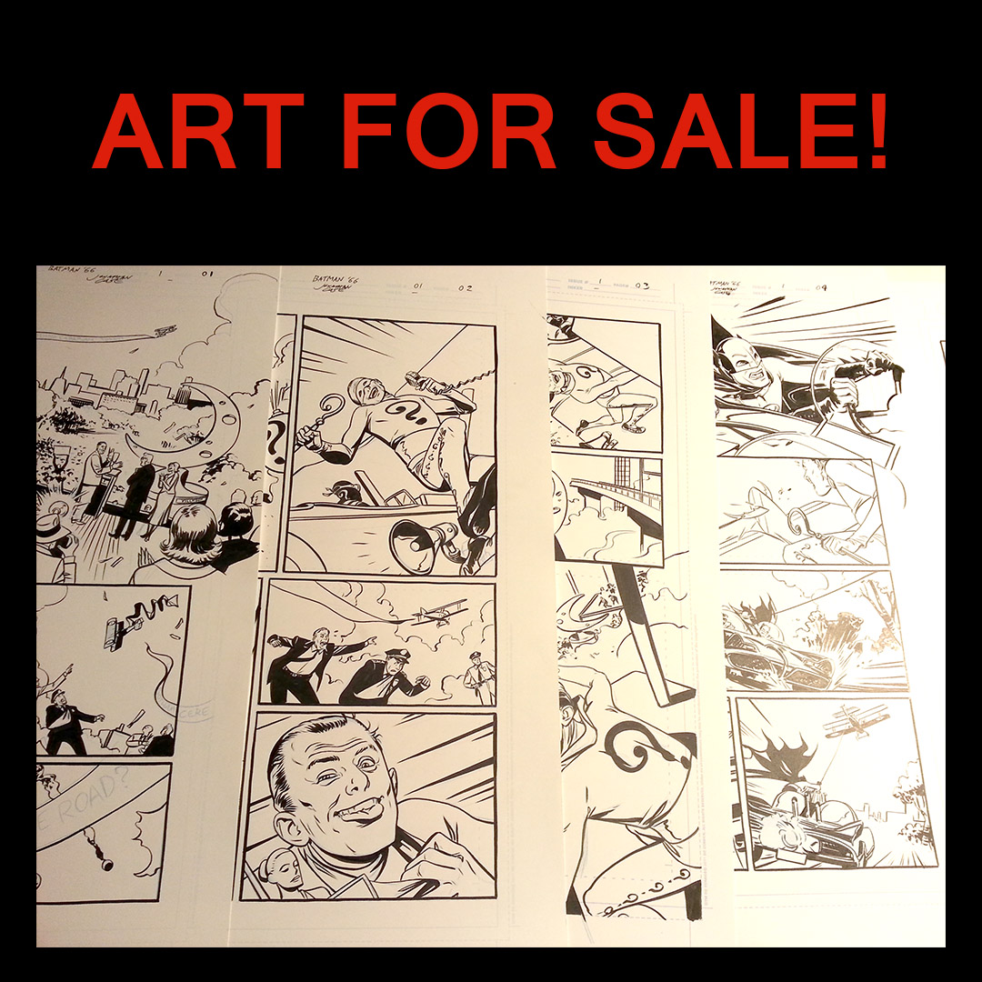
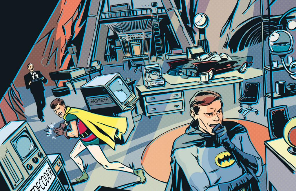
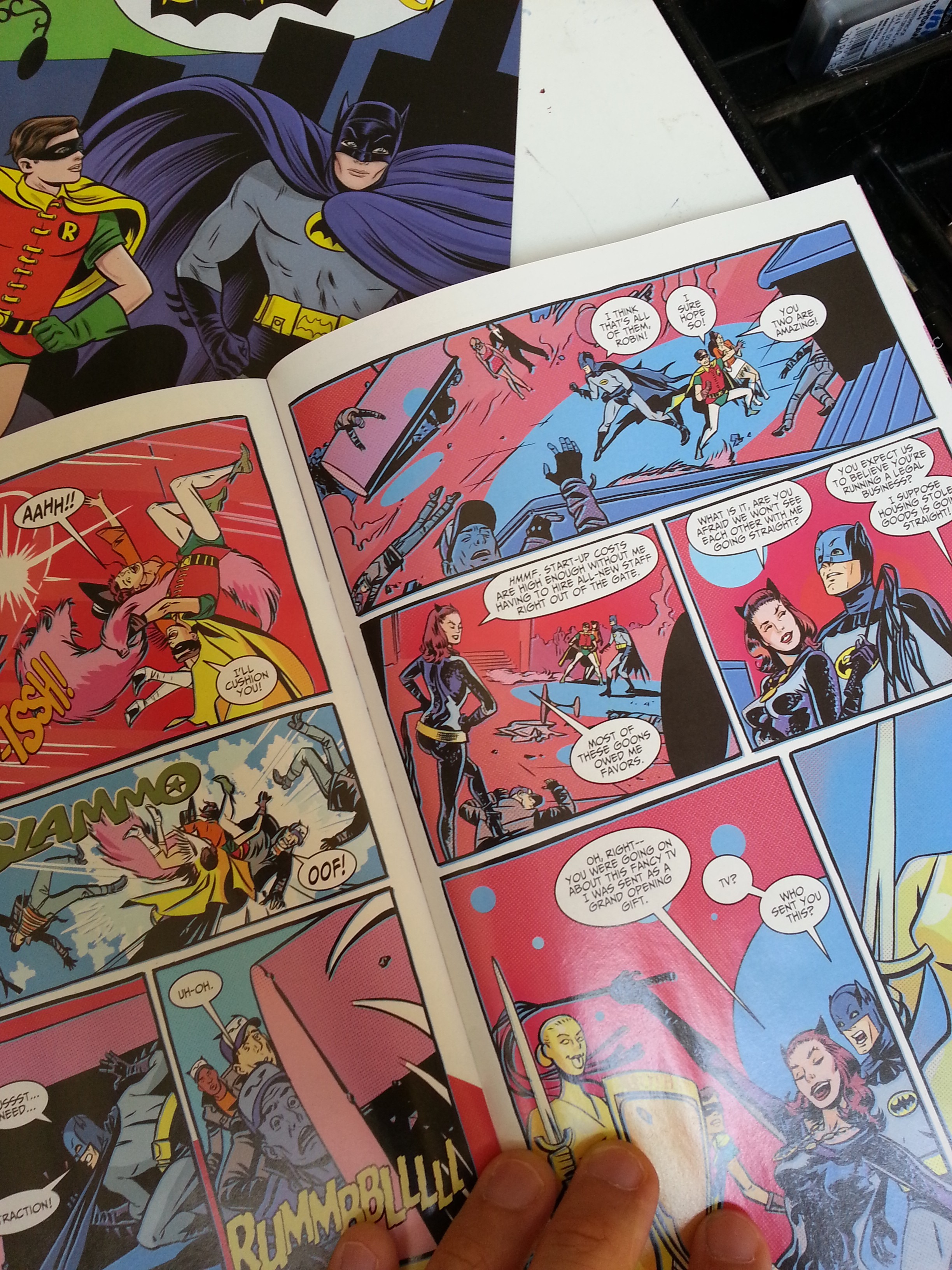
It's out today! In print! I'm really happy with the way Batman '66 looks in its print incarnation. The colors reproduced beautifully, and while the bells and whistles of the digital edition are definitely fun, as a comics artist, this is still my preferred way to enjoy comics.

That said, if you want to grab part 3 of the digital run, it's probably our best use of the technology yet. Get the technology at Comixology. Bat-Rap.

And, to celebrate this release, how about some watercolor commissions? These are hot off my desk and headed out to their new owners today.

Batman and Robin Batgirl_commission

Good Wednesday to you.


Batman '66 is a Bestseller

"We're #1, chum."  

Thanks to everyone who turned out in Ben-Day dotted droves this week to make Batman '66 the #1 selling comic on Comixology! I'm sitting here typing in my underwear, but in my mind, I'm on a giant float with Jeff Parker, going down some major city boulevard, surrounded by confetti, in my underwear.

Seriously, response has been fantastic. Here's a blurb-fest:

"Batman '66 is the best Batman comic in years." 10 out of 10 - Starburst Magazine

"Batman '66 is nothing short of brilliant." 9.8 out of 10 - IGN

"...Without question my favorite DC book of the year..." - ComicsAlliance

"It’s the most fun you’ll have with words and pictures today... It's stellar stuff." - iFanboy

"Batman ‘66 #1 is a wonderful comic." -Nerdspan

You best be geared up for the next part, out tomorrow. Because, Catwoman.


Batman_66_Jonathan_Case

Something Eerie for July 10th

What a month! Along with Batman '66, I have a second, equally retro-cool comic coming to shops this Wednesday, July 10th, as part of Eerie #3. Eerie#3

Saturnian Infantroids!

This one's an homage to Wally Wood space-race comics. It has comedy, horror, and giant space babies run amok. After becoming a dad and spending so much time in earnest adoration, it was time to shed light on the dark side of cute babies. The dark side of the babymoon.

I drew this while I took loving looks at my giant EC Stories collection. What I discovered: In almost every respect, the gap between myself and Mr. Wood is much like infinite space itself. Still, it was a fun challenge, and I'm pleased with the results.

I promise you a very weird time.

For a preview of this, and the book's other stories, head over to Comicosity.

Batman '66 Makes its Comixology Debut - Today!

Batman 66 is OUT!  

Batman '66 is out, in a digitally-enhanced edition. It's weekly. It's all-ages friendly. And it's 99 cents on Comixology. How about that?

"But wait," you say, "what's all this about digitally enhanced blah-bah-dee-blah? Are you trying to get me to read motion comics?"

No, in fact. Today's release is more like a guided-view comic (where the Comixology software escorts you around the page elements), but with some significant perks, driven by the creators. The entire print comic has been reworked, expanded, and retooled by me, personally, then handed over to the engineers (I like calling them that) at Comixology. So all the enhancements are largely based in what our small creative team wants readers to see, and (importantly) what we think will look cool. Here's a quick look at how we make the sausage.

I drew all the art as if for print, with the narrative connections from panel to panel that are essential to reading a print comic. I wanted to make a comic book, so when you pick it up in stores, it's going to look like a comic book should look.

Inks

After I completed print art, I set about expanding certain sections for the digital version based on a master plan created with Jeff (writer), Jim (editor), and John (Comixology guru). Man, that makes 4 'J's' on this book. Never thought of that before. ANYWAY.

One effect I'm proud of engineering is the Batmobile's big reveal, where we do a fast pan from one panel, through a field of clouds and speed lines, to the next panel, and a big impact shot. Initially, Comixology warned that the effect might require an image too large for their system, but they made it work, and I think it came out very well. Wired has a video of all this on their website (thanks, Wired!), plus some further discussion, so you can check it out for yourself.

Transition

So there's a taste of what your 99 cents buys you. I'm really looking forward to seeing this in print, but I'm also glad that people who buy digital get added value. Not to stop anyone from buying both, certainly.

Have a great comics Wednesday, everyone. The Twitterverse is all lit up with good Bat-vibes (eh?), so this wild experiment may have worked.

More to come!

Batman '66 Week Starts Now

Batman '66
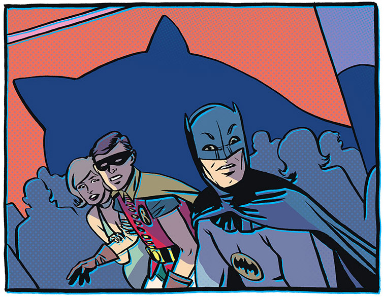
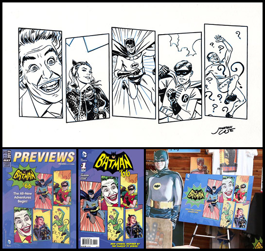
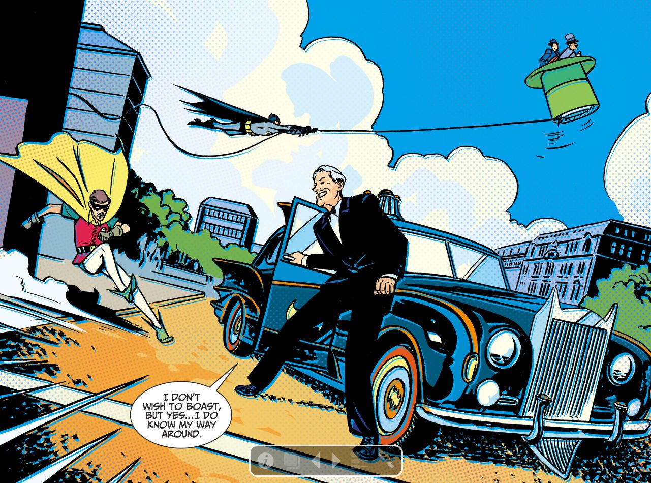
It's BAT WEEK, boys and girls! Batman '66 #1 (part 1 of 3) goes on sale in a digital enhanced edition this Wednesday, and to make with the pomp and circumstance, the NY Post is running a series of articles and blog posts detailing the project. Today, there's an interview up with me, Jeff Parker (writer), and Mike Allred (cover artist), and another post with some general info. Coinciding with '66's release is an announcement from Comixology that comics like this will now be available on a subscription basis. Pretty cool option for a weekly series.

I'll try to put up some behind-the-scenes material as the week progresses. For now, head over the NY Post to catch some freshly revealed artwork!

Hope you dig it.

Batman '66 Plane

Surface Pro Pen Pressure for All

PS_Surface They did it! After three months of no pen-pressure support in programs like Adobe Photoshop, Painter, and Paint Tool SAI, Microsoft and Wacom have worked out a driver for the Surface Pro that fixes it all. Head over here to snag it:

www.wacom.com/feeldriver

This is a great thing for a couple reasons.

Number one, it makes the Surface Pro a useful device no matter what creative programs you run. You can now get one with the confidence that pressure support will work as you'd expect across all your major programs.

Pressure support on Surface

Number two, it works very well. Better, in fact, than previous Wacom pressure drivers I've used on tablet PC's. Remember that Fujitsu T902? It, and other systems like it suffer from less-than ideal palm rejection (meaning every once in a while your canvas goes "SEE YA, I'm going over here now because you touched me with your hand before that pen tip, and that hurts me"). There's also typically a weird bug where every fiftieth brush stroke or so, these systems randomly lose pressure support, leaving you with the burden of hitting 'undo' frequently. Granted, the driver's only been out for a day, but so far I've experienced none of that with the new Wacom driver on the Surface. It works more like what I expect from Microsoft's Ink API, where palm rejection and pen pressure are very consistent. This all makes me a happy nerd.

The New Hotness

In other news, I've done another upgrade to my setup in the form of a different pen. This is the Wacom Bamboo Feel (I got the Carbon, because it's more durable and has a nice weight in my hand). I find it to be more accurate than the stock Surface pen, and more similar to the calibration of the pen on my old Cintiq. Explanation:

GAH! Stop hiding!

With the stock Surface Pro pen, the little doohickey that says "Here I am" to your on-screen cursor is placed slightly back in the barrel of the pen, instead of the pen's tip. This means that the cursor is usually hidden beneath the pen tip instead of being just in front of the pen tip, as you'd be used to if you use a Cintiq, or other tablet device.  This picture's taken from the side, so you can actually see the cursor, but when viewed normally, facing the screen, you totally can't see it. There are attempted calibration workarounds to this, and I tried them all and found them insufficient.


Switching to the Bamboo Feel, you can see the difference in registration: that cursor is right in front of the pen tip, where you expect it to be. This makes joining fine lines in a drawing and picking through tiny interface elements on the Surface's hi-res screen MUCH easier, at least for me. Your mileage may vary, but I'd say give it a shot if you aren't satisfied with the stock stylus's accuracy.

Tech blogging complete. Moving back to pretty drawr-rings.


Surface Pro Lap Board

  It's a Nerd's World.


People have been asking for specifics on how I made the lap board for my Surface Pro. It's a pretty simple system, but one that's very effective for using the Pro on my lap or on an inclined desk, like I normally use for drawing. And it's a great conversation piece at parties, because now you can bring all your work to parties and sit in a corner and draw Batman.

Keyboard Support

The basic problem I needed to solve: The Surface Pro's keyboard can obviously lay flat with the machine, but it's very thin, and attaches just beneath the screen, leaving about 5/8" of space beneath where it would rest most naturally. If you try and type on it like this, you're always pushing the whole keyboard around and missing keystrokes. It just doesn't work. With the lapboard, I get a perfect support so I can type anywhere easily, and more importantly, have access to my art programs'  keyboard shortcuts.

Blah, blah, blah, you say. How did you make it?

Like this:

The lap board: One piece of smooth 1/4" MDF, cut to 11" by 15.5"

The keyboard support: One piece of something that's 5/8" thick, 11" wide and 6.25" tall. I used a piece of wood for this that wasn't thick enough and added a few pieces of thin cardboard to make up the difference. Thus, there's duct tape on my otherwise nicely wood-glued assembly. You need not do that. Just make it 5/8".

The bumper-things. Two lengths of 3/4" trim, cut to 10.75" each - the kind I got is like one quarter of a cylinder (There's probably efficient terms for all these things, but I'm not Bob the Builder, sorry). This makes clearance for the angled edges of the Surface Pro. The Vapor MG casing  scratches really easily, so I made sure to round things off wherever I could. The upper piece is the only one that comes into contact with the Pro. The lower one is optional, and doesn't do much but give a sense that the whole thing's a solid slab.

Surface cushion. I don't know what you call this. It's that weird non-skid stuff that old women put in cabinets to keep their frog mugs from sliding around. 10.75" by 6.25" I hot-glued this to the lap board. There may be a better way. Adhesive spray, perhaps?

Hugs. Two rubber bands, to hold the Pro to the board and provide another non-skid effect to the under-side (provides a little more security on my smooth, inclined desk). I want to find some black ones that are thicker, for aesthetic purposes and to hold it a little tighter. For now, these work.

It's a nerd's world.

So, once you have all that, use some wood glue and clamps to piece it together, then do a little Dremel action to make the rubber band slots and sand down the sharp places, and boom. You can now do your work while lounging. It's work and laziness together!

This gets it all done really well, but it would be cool to try v2 with lighter materials. If anyone wants to give me a 3D printer, I accept.

Have fun!

My Transition to Surface Pro and Manga Studio

Painting in Manga Studio 5 My fellow creative-industry Apple users: prepare thyselves. Heresy lies ahead. You may not like what I have to say. You may think I'm batty. That's fine. For myself, I'm at the end of a months-long quest for a more flexible workflow, and I'm having quite a bit of fun. It was a bumpy road getting here, but for me, moving my digital art production from a giant Cintiq to the Surface Pro was the right move. If you have a similar desire to break your desk-bound chains and put on the shackles of forever having your work with you, read on. We can share the crazy.

Evil? No, no, creative person. Not evil.

What I wanted: a truly portable Cintiq replacement with good ergonomics (boo to you, tablet PC), a full OS (boo to you, Samsung Note) and enough horsepower to run professional software with ease (boo to most of the rest of you). Tablet PCs (as opposed to slate PCs/hybrids/whathaveyous) have been around for ages, and initially, I tried one of the latest and greatest, the Fujitsu T902.

Blech.

It had tons of power (16 GB of RAM) and the standard Wacom digitizer, but it proved problematic for several reasons. Its hardware was awkward and difficult to hold (for me), its drivers were frustratingly glitchy, and its screen was lackluster. On paper, its hardware specs meant that all my software would run well, so I really wanted to like it. In the end, it just wasn't the right fit, so I returned it and continued the hunt.

I was initially turned off from the Surface Pro for its smaller screen and RAM limit of 4 GB. Photoshop users who work on large color files know the importance of RAM. Illustrating for print, 4 GB is adequate, but 8GB can make a dramatic difference. To that end, I started looking at a new Thinkpad called the Helix that's very similar to the Surface Pro, with some nice perks. It has a larger screen, double the pen sensitivity, better battery life, better keyboard, and the option for 8GB of RAM. Unfortunately, it was supposed to come out in January, but missed its ship date several times over, and as of now, it's still not widely available. After purchasing that T902, I sold my Cintiq, because I play it fast and loose like that. After returning the T902, I was without a digital art tool. You may ask why someone who makes their living with digital art tools would put themselves in such a position. To you, I say, in a child of Bill Cosby voice, "I-DOH-NOH!"

Bye-Bye, Behemoth.

There's been a lot of mixed press around the Surface, and a whole bunch of Apple users (I've been one for years) will forever be set against anything non-Apple. For them, the closest option in this category is the Modbook Pro, but it lacks a keyboard, has a non-touch optimized OS, and is ridiculously expensive. Like, three times the price of a Surface Pro expensive.

Back to the Surface, there's also the concern for digital artists that several months after its release, it still lacks a pressure-sensitive driver for WinTab coded software. All this gobbledygook means is that the Adobe Creative Suite, Painter, and other major creative applications lack pressure support (imagines self as Microsoft engineer and smacks head). Usually, you can just download a Wacom driver and apply it to a system like this, but in this case, Microsoft monkeyed with the Wacom hardware/software and made it proprietary, meaning, no driver for you. Yikes. Another annoying issue in trying to run the Creative Suite on the Surface: you can't hold and click the tool bars to access sub-tools with the pen. It's some kind of problem with the driver not registering a click-and-hold in Adobe software. Beats me. At any rate, those are big points against the Surface. Will these problems be fixed? Microsoft tells me so, but it was almost enough to get me off the boat, until I made an important discovery called Manga Studio 5. More on that later.

Newmar-riffic.

So what does the Surface Pro get right? I like the shape of it, I like the portability, I like the quality of the screen, in spite of its high resolution making some interface elements tiny. Bifocal users, beware. Ironically, one of its best qualities for my use-case is something Microsoft never intended - laying the screen and keyboard flat so I can work on an inclined surface, like a drafting table, and have access to keyboard shortcuts. One of the things I disliked about my Cintiq was the clunky nature of using a keyboard for shortcuts when that big screen was taking up so much desk space. Wacom tries to fix this by giving you programmable buttons on the Cintiq itself, but somehow those are never enough for me. I guess I use mad keyboard shortcuts. With the Surface, my keyboard shortcuts are directly under that little screen in a very convenient place. It works well for me, especially after I built a little custom lapboard, which supports the keyboard in a solid way and holds everything in place. This way I can use the machine on my desk or on my lap equally well.

One trip to Home Depot later.

Right now, people are either shaking their heads in disbelief or nodding them with nerdly DIY approval. Again, I'm having fun, and it actually works. I can pack the little lapboard in my backpack with the Surface, and head to my studio, or a client's office, and go to work with naught more than a chair. Just a couple days ago I worked on contract for a local design firm and did 100 storyboards in seven hours with this setup.

But what about the Creative Suite, and all that driver brokenness?

Soon after I picked up the Surface, I faced that problem. I had a job I needed to do, and no functional Creative Suite with which to do it. I went looking for a temporary solution. It turns out that some very good software does support Microsoft's drivers, including Sketchbook Pro and Manga Studio. I'd never given Manga Studio a chance, because I was so used to Photoshop and got turned off by the clunky interface of older versions. People lauded it, but I was too stubborn and set in my ways. I knew Photoshop wasn't a good replacement for drawing with pen and paper, so I didn't expect Manga Studio to be much better. I figured Wacom hardware was the main limit between what I could get from traditional media and what I could get from digital. With digital tools, I've been used to getting maybe 50% of the control and finesse I can achieve with good old pencils and brushes on paper- that's with the pro-grade Cintiq. It's fine for coloring, edits, and quick and dirty jobs like storyboarding, but from what I'd experienced, it couldn't hold its own against pencils and paper.

Manga Studio changed that for me in a big way.

Get your Gorshin on with Manga Studio 5.

With its latest version (5), Manga Studio has a fancy-pantsy new brush engine. What was already markedly better than Photoshop became hugely better with this latest release. I can now get results that are 90-95% of what I'd expect to get with traditional media, and that's just the brush engine. There's also superior capabilities in terms of layout, coloring, and perspective tools. I came to my studio as an evangelist, and immediately got 15 colleagues to make the leap with me. So far, everyone's digging it, and thanks to the new version's UI being similar to Photoshop's, the transition hasn't been difficult.

They aren't even paying me to say this, but listen: If you're an illustrator and haven't given Manga Studio 5 a shot, please do. I think you'll be pleased. The current Debut version lacks a few of the capabilities of their previous EX version, but an update's coming this summer that adds those features back in. In the meantime, you have a fantastic piece of software that has all the brush-creation, actions, CMYK color space, and tools you never thought of, for like, so little money it's hard to take seriously. Try it.

Pencils in Manga Studio.

I made the switch to doing all my comics pencils in Manga Studio on the Surface with Batman '66, which I'm leading off for DC. Likewise, an Eerie short story for Dark Horse. This is an example of my Manga Studio blue-line art, and it's really indistinguishable from my traditional pencils. I can then print it out on our large format printer and ink it traditionally. That way I don't have to spend my whole life in front of a screen, and I have original art to sell if I choose to do that (and choose to do that, I will).

Batman

But even if I didn't want to do inks traditionally, it's possible to get really good inking results on the Surface with Manga Studio. Here's an example of our launch art. After they had me execute this (pencils in Manga Studio, then inked traditionally), DC came back and requested I expand all the characters to full figures. I was able to bring the original art into Manga Studio (I'd already colored it there) and expand each figure and their colors with seamless results.

Those elfin shoes crack me up.

I've even started playing with digital painting, which I haven't done before, using the Surface/Manga Studio combo, and I'm really digging the results. It makes me want to get out my oil paints, and that's about as high a compliment as I can pay a digital tool (I've kept those paints in a box since college).

By the way, when you get Manga Studio, as you will, be sure to check out Ray Frenden's MS5 brush set. I'm using it daily, and it's fabulous.

So that's my journey so far. There seems to be a lot more on the horizon in terms of these portable solutions, so things will only get better. For the sake of artists who will never leave the Apple ecosystem, it would be great if Cupertino tried their hand at something like this, but Steve Jobs once said, "if they include a stylus, they've failed", so that's probably not gonna happen. Even so, if you're well heeled enough to have two Cintiq-like devices, one for your office, and one for the road, I'd recommend something along the lines of the Surface.

Or just be crazy like me. Bite the bullet and make this your sole computer/art tablet/etc. It's scary, but it's also the first time that upgrading to a new system actually made me money, since I sold my Cintiq and Macbook for much more than the Surface cost (and they were both four years old).

And now I can run free as bird, unchained by the... oh, yeah. Work's with me everywhere now.

Back to it!


Holy Retro Batman Announcement

Batman  

Today I get to announce some really fun news. Really. Fun. Comics. News. My studio-mate and fellow lover of retro, Jeff Parker, is set to write a new series of Batman comics for DC, and I'll be performing art duties for the first three stories, from layouts to color.

This isn't just any Batman though. This is the Adam West Batman, the Batusi Batman, the Julie Newmarriffic Batman. DC licensed the rights to all the actors from the 60s TV show (!), and we're set to start reeling and rocking this summer. Really, if they let me develop with any superhero project, working with whoever I wanted, I honestly couldn't have come up with a better fit: lighthearted, kid-appropriate, retro, and written by one of my favorite comics writers. The script Jeff's writing for this series is gold. You can feel his love the material, the era, the Julie Newmar.

DC announced the project last night at an event in Los Angeles. Mr. West appeared for a signing with the original Batmobile, a replica of the Bat Cave... even Batman cupcakes. Here's the press release. You can see a glimpse of my art at like, 4:13.

BATMAN CUPCAKES.

I really don't need to say more than that.

Julie Newmar Catwoman

If you want more info on all this, head over to DC's site (I think they have a bunch of 60s Bat-stuff they're announcing), or Jeff's blog. As for me, I'm going to start some layouts.

Holy happy circumstance.

Sloth Love


Every once in a while, you get to do a commission that satisfies all your geek requirements. This one may be hard to top. It has it all: Romance, awesome creatures, a Dracula cape... A land-squid.

I couldn't ask for more! It's projects like this where I'm keenly aware that it's not everyone who gets an all-expenses-paid trip to the Slothlands. I'm grateful.

Also, here's a link to a hi-res version, in case you want some sloth-love wallpaper.

This weekend, I'll be at Emerald City Comic Con, taking commissions (you can totally commission something like this, and I'll mail it to you) and peddling my wares. I may even see if I can get some prints made of this piece.

See you in Seattle!